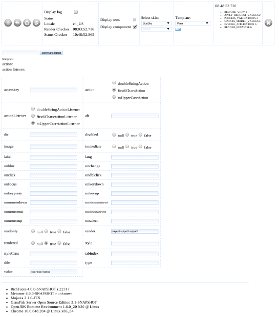
This tutorial shows how to add a new component to the Metamer, a test application for RichFaces 4. It will add standard JSF command button with all its attributes. All other components can be added in a similar way. Tutorial shows how to modify front page, list of component pages and how to add a simple page with command button and all its attributes. There will be one input text, command button for submitting form and three outputs. The first output will be the content of the input, the second will be the input processed by selected action and the third will be the input processed by selected action listener.
Front page
components.put("commandButton", "JSF Command Button");Managed bean
@PostConstruct
public void init() {
    logger = LoggerFactory.getLogger(getClass());
    logger.info("initializing bean " + getClass().getName());

    // for non-RichFaces components
    attributes = Attributes.getComponentAttributesFromClass(javax.faces.component.html.HtmlCommandButton.class, getClass());

    // for non-RichFaces behaviors
    // attributes = Attributes.getBehaviorAttributesFromClass(javax.faces.component.behavior.AjaxBehavior.class, getClass());
    // for RichFaces components
    // attributes = Attributes.getComponentAttributesFromFacesConfig(org.richfaces.component.UIAccordion.class, getClass());
    // for RichFaces behaviors
    // attributes = Attributes.getBehaviorAttributesFromFacesConfig(org.ajax4jsf.component.behavior.AjaxBehavior.class, getClass());
}
Actions and Action Listeners
public String myAction() { ... }

public void myActionListener(ActionEvent event) { ... }
Since the actions and action listeners usually won't be called directly, their names have to end with Action or ActionListener.
List of pages
Test page with attributes
<!DOCTYPE html PUBLIC "-//W3C//DTD XHTML 1.0 Transitional//EN"
          "http://www.w3.org/TR/xhtml1/DTD/xhtml1-transitional.dtd">
<html xmlns="http://www.w3.org/1999/xhtml" xmlns:h="http://java.sun.com/jsf/html"
      xmlns:f="http://java.sun.com/jsf/core" xmlns:ui="http://java.sun.com/jsf/facelets"
      xmlns:a4j="http://richfaces.org/a4j" xmlns:ta="http://java.sun.com/jsf/composite/testapp">


    <ui:composition template="/templates/template.xhtml">
        <ui:define name="view"/>
        <ui:define name="head"/>
        <ui:define name="outOfTemplateBefore"/>
        <ui:define name="component"/>
        <ui:define name="outOfTemplateAfter"/>
    </ui:composition>

</html>
- view - will be put inside f:view but outside h:head and h:body, e.g. f:metadata should be put here
- head - javascrip, css and metadata
- component - component will be placed here
- outOfTemplateBefore - everything what should be placed above component
- outOfTemplateAfter - everything what should be placed beneath componet
View parameters
<ui:define name="view">
    <f:metadata>
        <f:viewParam name="templates" value="#{templateBean.templates}">
            <f:converter converterId="templatesListConverter" />
        </f:viewParam>
    </f:metadata>
</ui:define>
Component section
<ui:define name="component">

    <h:panelGrid id="panel" columns="2">
        <h:inputText id="input" value="#{buttonBean.input}" />

        <h:commandButton id="commandButton"
            action="#{buttonBean.attributes.action}"
            actionListener="#{buttonBean.attributes.actionListener}"
            ...
            execute="@form"
            immediate="#{buttonBean.attributes['immediate'].value}" />
   </h:panelGrid>


   <h:panelGrid id="outputs" columns="2">
       output: <h:outputText value="#{buttonBean.input}" id="output1" />
    </h:panelGrid>
</ui:define>
Notice how action and actionListener attributes are defined. Actions and action listeners aren't called directly because they can contain null, a string or a method expression. Therefore this universal approach, usable by all components, was developed. All other attributes are mapped directly, see attribute value. Sometimes it is not possible to set a value expression. In these cases the attribute should be tested in other way, e.g. on separate pages.
Component section is by default wrapped in a h:form tag. In order not to render form, you need to define variable dontRenderForm in view's metadata section:
<ui:composition template="/templates/template.xhtml">
    <ui:param name="dontRenderForm" value="true" />
    ...
</ui:composition>
Attributes of tested component
<ui:define name="outOfTemplateAfter">
    <ta:attributes value="#{buttonBean.attributes}" id="attributes" render="panel"/>
</ui:define>
# attr.<name of attribute>.key=value
attr.styleClass.red=red
attr.styleClass.blue=blue
attr.styleClass.big=big
attr.styleClass.wide=wide
attr.styleClass.none=
attr.action.first6CharsAction=first6CharsAction
attr.action.doubleStringAction=doubleStringAction
attr.action.toUpperCaseAction=toUpperCaseAction
# testapp.help.<name of attribute>=value
testapp.help.action=Help for attribute action.
testapp.help.styleClass=Help for attribute styleClass.
When defining select options, it's good to select default value in bean. For our case, put the following into CommandButtonBean:
@PostConstruct
public void init() {
    ...
    attributes.setAttribute("value", "command button");
    attributes.setAttribute("rendered", "true");
    attributes.setAttribute("render", "output1 output2 output3");
    attributes.setAttribute("action", "first6CharsAction");
    attributes.setAttribute("actionListener", "toUpperCaseActionListener");
}
Models
All iteration components need some model. There are two models defined in managed bean Model.
#{model.capitals}
Simple model that should be used only if more complex model would be overhead.
- String name
- String state
- String timeZone
#{model.employees}
If there is a need for testing advanced features, this model should be used. Employees' names were chosen in such a way that there are names starting with digits, unicode names in Latin and Cyrillic, some names are there many times. If data are grouped by name or title, it is alway possible to sort them or filter them and see some results.
String name
- suitable for testing inputs and outputs
String title
- suitable for testing e.g. combo box
List<Company> companies
- Company = { String name, String state, String phone }
- suitable for testing iteration components
List<String[]> phones
- 0...type of the phone
- type is one of {"Cell phone", "Work phone", "Home phone"}
- 1... phone number
- suitable for testing iteration components
java.util.Date birthdate
- suitable for testing calendar component and inputs/outputs with converters & validators
java.awt.Color favoriteColor
- suitable for testing color picker
int numberOfKids
- suitable for testing slider, spinner and other components showing numbers
boolean smoker
- suitable for testing boolean values - checkboxes, radio buttons
Sex sex
- Sex is an enum containing FEMALE, MALE
- there are two images in /resources/images that can be used on pages
String email
- suitable for testing regexp validators
Conclusion
For further reference, please have a look into source code
- managed bean
- properties file
- list of pages for a component
- page with command link and its attributes
- css

Comments