WORK IN PROGRESS : DOCUMENT IS READY FOR REVIEW
(Functional Requirements and Business Rules will be added after General Review)
In Place Editing
Functional Specification
1 Introduction
1.1 Definitions
1.1.1 In Place Editing
The principle of "In Place" editing is to view and edit a portal and its content. The overall UI is the same, we just change some bits of it to allow edition when needed.
We differentiate "In Place" editing from Inline editing and "In Context" editing. Editing "in context" is the possibility to edit content from the front-end. Most of the time, we redirect the contributor to an application (i.e. Content Explorer), he edits the content, then goes back in the website in the previous context state.
Inline editing is the ability to edit content directly in place (by adding dynamically a WYSIWYG editor for example. It's a key element of "In Context" editing.
Page composing
1.1.2 Zoning
When we build a page, we use a layout to help positioning contents in the page. Zoning will allow the portal to switch from one page layout to another without loosing the content inside each zone.
We can refer to zoning layouts if we can identify each zone. As each Zone is identified (by a position number, a name), we can then match a zone on different layouts.
2 General Specification
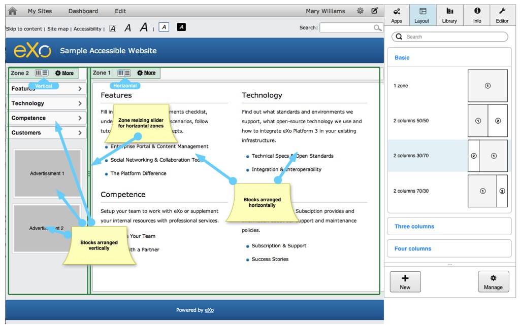
2.1 Editing Panel
2.1.1 Overview
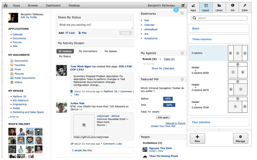
Figure 1 : Editing panel on the right of the page
The editing panel appears by a simple action on the page. In the above mock-up, we use a button in the navigation bar to show/hide the panel (see 1). Depending on what will become the navigation bar (refer to Navigation Bar specification for more details), the button could be replaced by another User Interface element but the User Interaction should follow these rules:
- One click to show the panel, no more
- No full page refresh, the UI should change without a full reload
- Panel appears on the right of the site to avoid CSS positioning problems. If absolute positioning is used in the front-end, it is with top/left references. Thus, it’s more secure to attach the editing panel to the right.
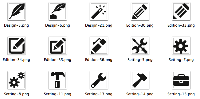
The choice of the main icon to open the editing panel should represent what would be done. Below are a few examples of possible icons.
Some of them are already used elsewhere (Setting-7, Setting-13). I chose Edition-35 in the spec as it's a generic one (easily understandable) and we still have the choice to use different pencil based icons else where.
I personally like very much Design-5 and Setting-15 as they are unique ; first one is more a symbol for writers/contributors, last one represents a toolbox which is not far from what we do here but it's less "poetic" than the first one. So, it depends of the "spirit" we want to give to our users at the end.
2.1.2 User interaction
The editing panel has different areas but each one has a specific role.
We define then as following:
- Editing Tabs: separate areas to edit the page, its contents or its layout.
- Contextual Search/Filter: search bar that reacts according to the current tab. It can search into contents or filter the current results.
- Main Area: where we put the main user interaction
- Optional Actions: Depending on the tab, we keep a bottom action bar
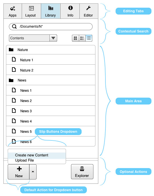
In this mock-up, we can see key elements:
- Search a specific content (simple filtering option actually more than search here)
- Browse contents
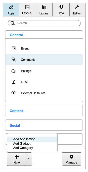
- Create a new content by clicking on the “New” button or uploading a file but clicking on the right to show the dropdown action menu.
The idea is to see the default features at first sight and to avoid popup windows.
2.2 Templates
A page template is referenced as a layout (with zones) + some preconfigured applications.
We distinguish a template and a layout in this specification.
2.2.1 New page from template
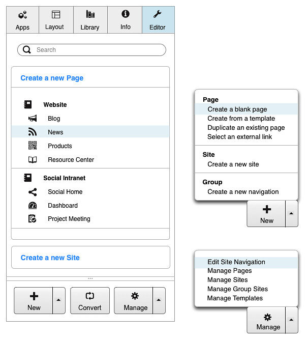
As we want to focus on simplicity, we make “Add page from a template” a “direct-access” feature. The first thing the user will notice in the Editor tab is the possibility to create a new blog or a new news page.
The rest of the features will be mostly accessible through Dropdown buttons.
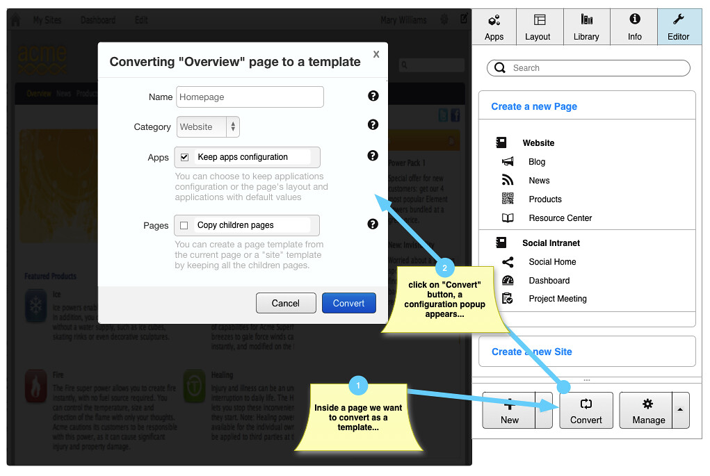
Also, in the optional actions, we add a “Convert” button so it’s easy to see that we can convert the current page to a new template.
2.2.2 Convert a page to a template
2.3 Zoning
By introducing the Zoning paradigm, the way to build pages is completely rethought. Today, when we create a page, its layout becomes very static, it’s very hard to redefine the layout. We have to move a lot of containers if we want to move from a 4 zones layout to a 3 zones layout for example. Even moving from 3 zones to another 3 zones layout requires a lot of time.
We should identify each container as a zone so we can switch from one layout to another very easily.
To identify a zone, we will use a Position based layout rather than a Name based. A Name based layout requires extra work as each name must be stored somewhere for future references. It's also more complex in term of UI and User Experience but as it's more complex, it offers extra features. For example, if you associate zones to Header, Content_1, Content_2, Footer, you can easily provide multiple layouts using the same names. If you do the same with position numbers, you may end up with inverted zones (see Zoning scenarios for more explanation).
That said, Position based zoning offers great flexibility with very simple UI. Extra features offered by Named zoning are not worth the price and also add more complexity. As we focus on User Experience, simplicity and flexibility, this wouldn’t be the best choice for our portal.
Zones would be defined by a grid layout system (http://www.w3.org/TR/css3-grid-layout/).
2.3.1 Layouts proposal
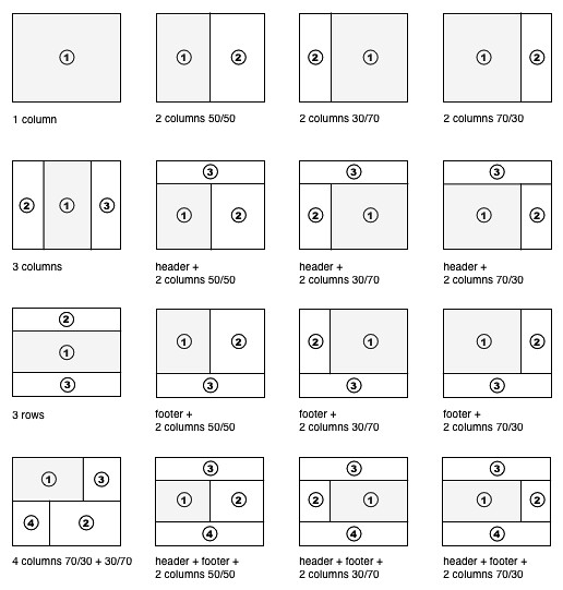
There are important rules to follow:
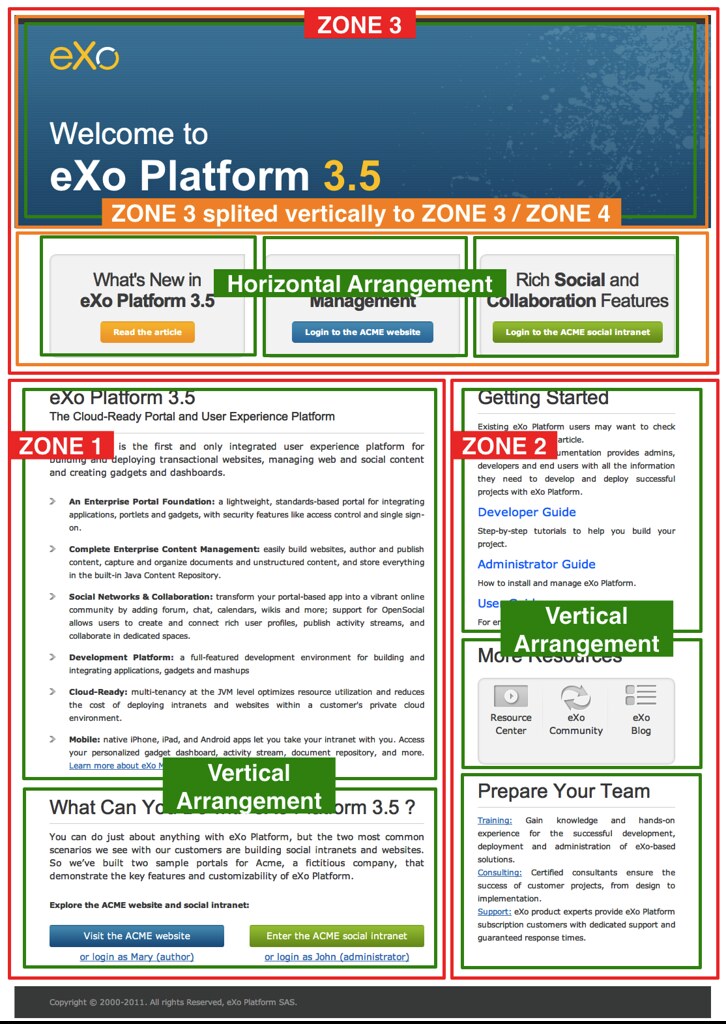
- Zone “1” should always refer to the main area.
- Columns layout is preferred to Row layout. At the end, each Application will be added vertically inside each zone. Thus, there’s no need to define such layouts.
- Layouts have default sizes (factor of 12 – based on the Grid system). These are default values and can be changed after applying the layout (preference inside each zone)
NOTE : Percentage vs Grid : we refer here to percentage widths (30%, 50%, 70%). Using the Grid System, it will be more 4/12, 6/12, 8/12.
NOTE : Main Area ; In the Page layout editing, zone 1 is not different than the other zones. We will see later in the “Site Layout” section of this specification that it has special behaviour.
2.3.2 Switching Layouts
By choosing a logical zones positioning across layouts, we can switch very easily from one layout to another without loosing its structure.
2.3.2.1 Switch between 3 zones layouts
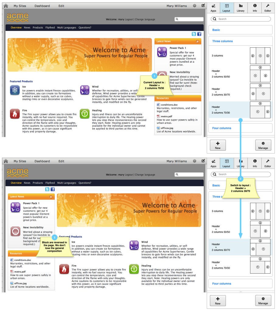
In this example, we switch from a 3 zones layout (header + 2 cols 70/30) to another 3 zones layout (header + 2 cols 30/70). Of course, it’s the trivial scenario; let’s see more corner case scenarios.
2.3.2.2 Switch from 4 zones to 3 zones
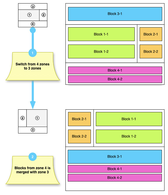
In the above example, blocks from the removed zone (i.e. zone 4) are added to the last zone available (i.e. zone 3).
2.3.2.3 Switch from 4 zones to 3 zones: the worst can happen
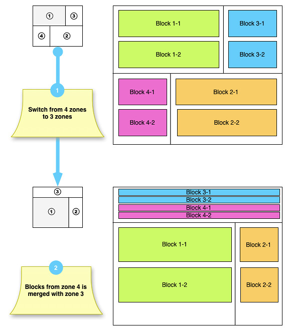
In this example, we end up with a lot of blocks arranged vertically in the zone 3.
We could have a better result if we could simply organize the blocks horizontally.
We would obtain this:
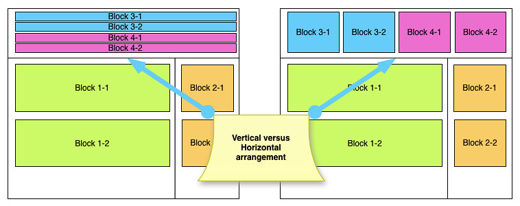
2.3.3 Vertical versus horizontal positioning
As we see, for more flexibility and a better user experience, it would be great to be able to arrange blocks horizontally or vertically.
Take a look of what’s possible with Bootstrap Fluid Grid System : http://twitter.github.com/bootstrap/scaffolding.html#fluidGridSystem
2.3.3.1 Vertical to Horizontal
With Bootstrap Grid System, we can easily change the orientation, up to 12 blocks.
Vertical:
1. <div class="container-fluid">
2. <div> BLOCK 1-1 </div>
3. <div> BLOCK 2-2 </div>
4. </div>
Horizontal:
1. <div class="container-fluid">
2. <div class="row-fluid">
3. <div class="span6"> BLOCK 1-1 </div>
4. <div class="span6"> BLOCK 2-2 </div>
5. </div>
6. </div>
2.3.3.2 Nesting zones and blocks
It’s also possible to nest elements, thus we can use fluid spans for zones and blocks inside each zone
Take this layout:
It would be represented like this:
1. <div class="container-fluid">
2. <div class="row-fluid">
3. <div class="span12" id="layout-zone-3">
4. <div class="row-fluid">
5. <div class="span6"> BLOCK 3-1 </div>
6. <div class="span6"> BLOCK 3-2 </div>
7. </div>
8. </div>
9. <div class="row-fluid">
10. <div class="span8" id="layout-zone-1">
11. <div> BLOCK 1-1 </div>
12. <div> BLOCK 1-2 </div>
13. </div>
14. <div class="span4" id="layout-zone-2">
15. <div> BLOCK 2-1 </div>
16. <div> BLOCK 2-2 </div>
17. </div>
18. </div>
19. </div>
20.</div>
In this example, we have two blocks inside each zones, blocks from zone 3 are using a horizontal arrangement.
In term of UI, we should be able to change the orientation very easily
As well of changing the orientation in “One-click access”, we should also be able to change the ratio between two horizontal zones.
2.4 Content composing
Our current Page manages 3 types of elements we can put on a page :
- Containers or set of containers;
- Portlets
- Gadgets
Note that Gadgets and Portlets are merged together in the same Application tab. As required in the UXP PRD, gadgets become first class citizens, just like portlets. Thus, we can always refer to Applications.
The idea is to use the same type of integration for new types of objects.
2.4.1 Objects
We should be able to reference new types of objects dynamically (by configuration).
Describing how we can interact with/declare new types of objects is not the subject and will be described in another specification.
A few types could be added as a first step:
- Flash
- Image
- List (of contents)
- Slideshow
- Text
- Content
From the library, we can automatically add a list of content in the page, or a Flash content or an image, etc. These apps are here to allow the user to put empty elements in the page to fill later or from within the app.
NOTE : These objects are already managed today in UXP; it's just a question of providing the right binding and the right User Interface. Again, this should be described in another specification (off topic here)
I see a last one that would really leverage a feature missing we have:
- External resource (such as CMIS rest point or RSS newsfeed)
We could finally benefit from other features in UXP like:
- Comments
- Rating
- Share
As described before, Apps will be organized by categories.
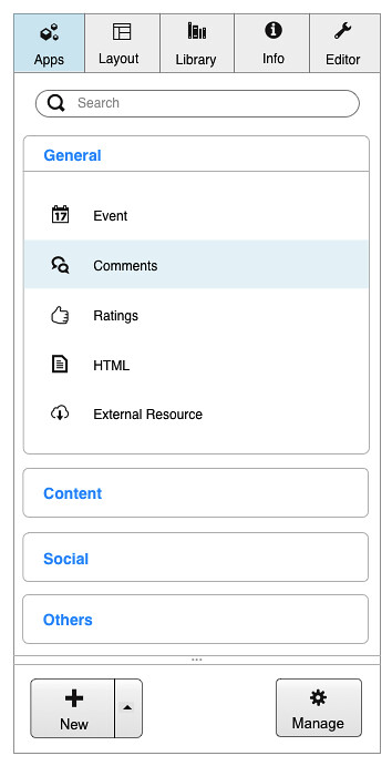 | 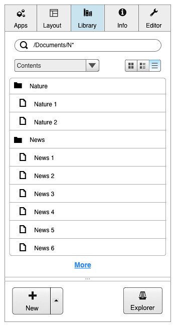 | 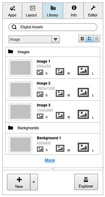 |
Figure 2: Adapted menu UI for different types
NOTE : In the above mock-ups, the 3 different “New” buttons don’t target the same action. In the App tab, we can add a new app (also available from the App Registry). In the Library tab, we can create a new content and a new Image in the last mock-up.
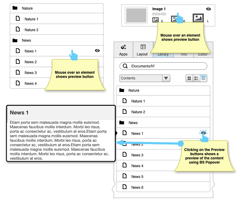
2.4.2 Preview
We can preview contents directly from within the results list.
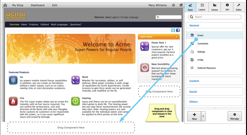
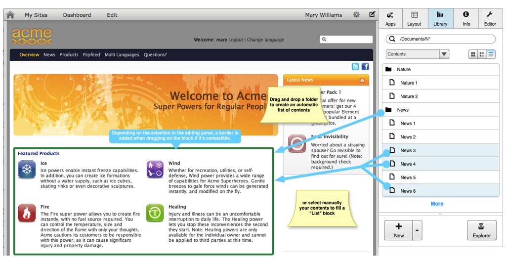
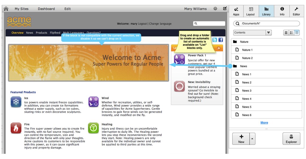
2.4.3 List of contents
Add an "Event" app inside a block
Fill an existing "List" component with contents:
2.4.4 Single content
For a single content, User Experience will be equivalent as the one for list but limited to "single selection" and "One content" blocks".
2.4.5 Media
We can cover here multiple type, such as Image, Video, Flash, Slideshow.
The User Experience should the same as the one explained for Contents. The difference is more in the Contextual Menu.
2.4.6 Applications
Drag and drop applications is equivalent to what we have currently in the portal.
2.5 Dynamic Contexts
2.5.1 What is it?
The parts that surround a particular element define a context. In our case, editing the site layout or the current page is almost the same in term of User Interface. We can say that by experience as we duplicate the same User Interface at two different places.
If we want to avoid duplication of UI Elements, we can define a surrounding context so the elements will interfere differently with the content itself.
NOTE : Possible contexts in the editing panel are Page or Site. We also suggest to remove the Gadget Dashboard and to replace it to a user page with Dashboard context.
2.5.1.1 Default context
It’s common sense that we add/edit more pages in production than we edit the site layout itself. Thus, we will define the page as the default editing context.
2.5.1.2 Context is Session only
Changing the context will affect immediately the interface and this change will be stored in the user’s session. When the user logs in again, default context (i.e. page) will be used.
2.5.1.3 Permissions
The Site context and Page context will use two different permissions. Thus, editors will be able to edit a page and will be limited in this context, when site administrators will be able to use the Site context to edit the global layout.
NOTE : Editor is a user assigned to a specific group. He then has special rights to edit a page and its content. Site Administrator profile is also assigned to a specific group. A Site Administrator can edit pages but also the site layout and its content.
2.5.1.4 Impact on the UI Elements and User Experience
UI Elements can change a bit but the User Experience must be the same. In other words, the context shouldn’t affect drastically the interface.
In the Editing Panel, Apps, Layout and Library tabs won’t change. Only the zone we edit on the page will be different.
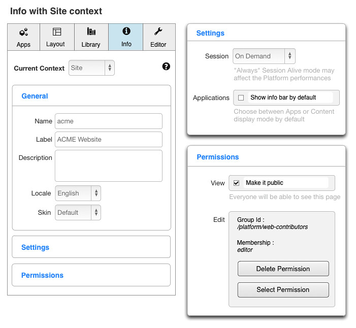
Info tab shows general info of the page or the site. This tab will change when using one context or the other.
2.5.2 Page Context
2.5.2.1 Merging Features
We currently have multiple settings for pages, we have :
- Page’s properties
- Navigation node’s properties
- SEO Metadata
Even knowing the difference between a page and a navigation node, it’s always hard to remember where we can set « show max window » setting or the « visibility ».
To provide a better User Experience, we need to put these settings in the same place. At the end, we will still store some parameter in the navigation’s node or in the corresponding page but the user must have only one panel to set up everything.
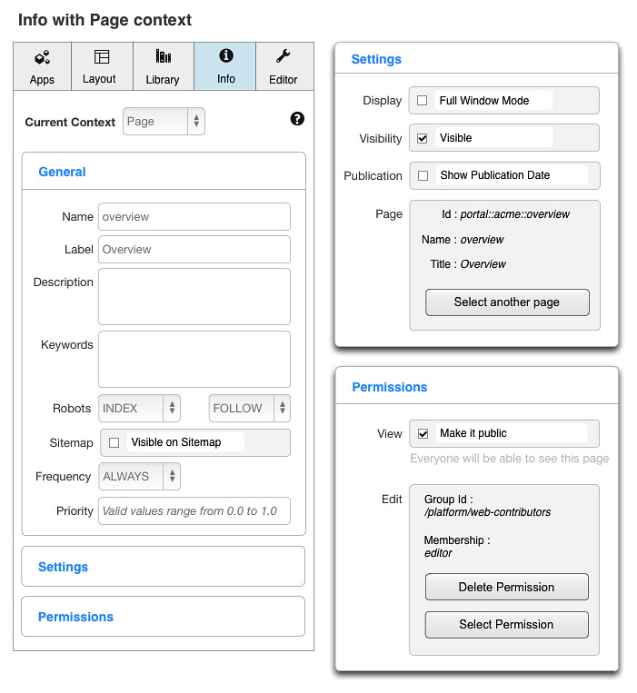
In this mock-up, we merged all the current properties into one panel. Of course, depending on what features will be added, some UI elements could be added or removed but the idea is to have everything in one place.
NOTE : To switch from one context to another, we simply change the context in the selector and the elements will be updated.
2.5.3 Site Context
Site properties are already all in the same place but hard to find. Thanks to the Site context, we will now have them available directly in the Info tab.
2.5.4 Layout editing with Site context
When editing the layout with Site context, we need to take the Main Area principle into consideration. Main Area is the reserved space in the layout where we will put each page contents.
NOTE : Main Area refers to the Page Body term in GateIn.

We demonstrate in this example a few concepts:
- Zone 1 of each layout always refer to the Main Area, we can’t create a Free layout anymore. In order to provide an easy way to create a page and save it as a template, we choose to remove this feature.
- The Main Area is obviously disabled (not editable) because its content will be defined per page.
- As the Main Area is disabled, we can’t also choose between horizontal or vertical arrangement. It makes no sense, as we will define an underlying layout on each page.
2.5.5 Editing panel with Dashboard context
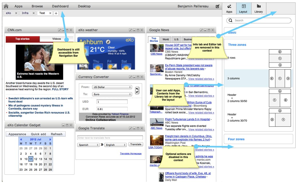
The above mock-up shows the editing panel in the Dashboard context. We can see that a few elements are disabled or not visible in this context due to the wanted limitation of the dashboard:
- We can edit the dashboard, add apps or contents but we can’t create new contents from here. UI elements are limited to the minimal requirements to manage a User Dashboard
- Info tab and Editor tabs are not visible
- No option are available inside the page to edit the layout (no horizontal vs vertical arrangement for example, no advanced options)
NOTE : The Dashboard context is a limited Page context. The user edits its own page and can add contents or change the layout but some features are hidden/removed to provide a very simple interface.
3 Features in details
3.1 Autosave, Draft and Publication
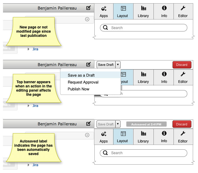
On the above mock-up, we can see those 3 features in action.
3.1.1 Autosave
Autosave is the ability to automatically save when a change is done for each change or when a change is done after a certain time.
Considering creating a page from scratch can take some time, the idea is to save each time an action is performed on the editing panel.
If not done automatically, the editor can manually save the page by clicking the “Save Draft” button.
3.1.2 Draft
Draft is the current version of the page (or site layout). This feature is required by the Staging requirement in UXP (see corresponding spec for more info).
In a few words, Staging is about of contributing on one site/instance/server and publishing on another for end-users. Thus, at one time, we have a Draft version on the “editing instance” and potentially a published version on the “live instance”. Ideally, contributors work on the “editing instance” only and end-users access the site on the “live instance. These instances can either live on the same server or can be two separated servers.
Note that there’s only one draft shared among editors
3.1.3 Publication
We won’t enter in the details of the publication in this specification; it should be covered by another UXP specification.
In a few words, if a workflow is used to publish a page, corresponding actions will appear in the Dropdown save button depending on the editor’s roles.
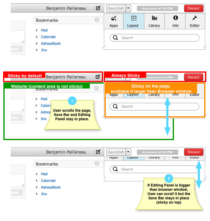
3.2 Sticky Save Bar
As it’s important to always see a change requires saving the page, Save Bar must stays in place. Thus, it will be Sticky on top. If the User scroll inside the page, Editing Panel also is Sticky on top.
An exception remains is Editing Panel is larger vertically than screen size. In this case, the User can scroll inside the Editing Panel.
3.3 Creating an Overview page from blank
The User Story we want to describe is very simple: a user wants to create an Overview page from nothing, How can he do it using the new Editing panel?
First, let’s see how we will organize the page. Starting from a standard 3 zones layout, we will split the top one in two, then add all our contents inside the page and create new content from within the Editing Panel as well.
3.3.1 Creating a new page
From the Editor tab, create a blank page

We show a simple popup with mandatory missing information in Editing panel.
Before we can work on the page, we must define where it is stored.
3.3.2 Default landing page
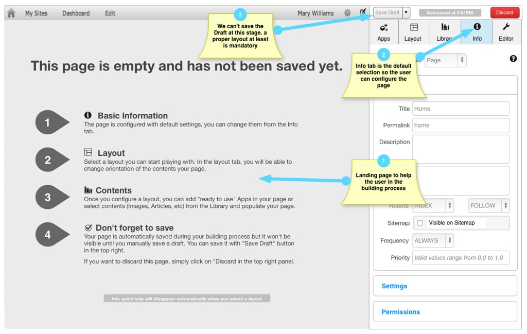
The landing page helps the user to build the page. Landing page is visible only in the Blank page scenario. When creating a page from a template, the “populated” page will be visible instead.
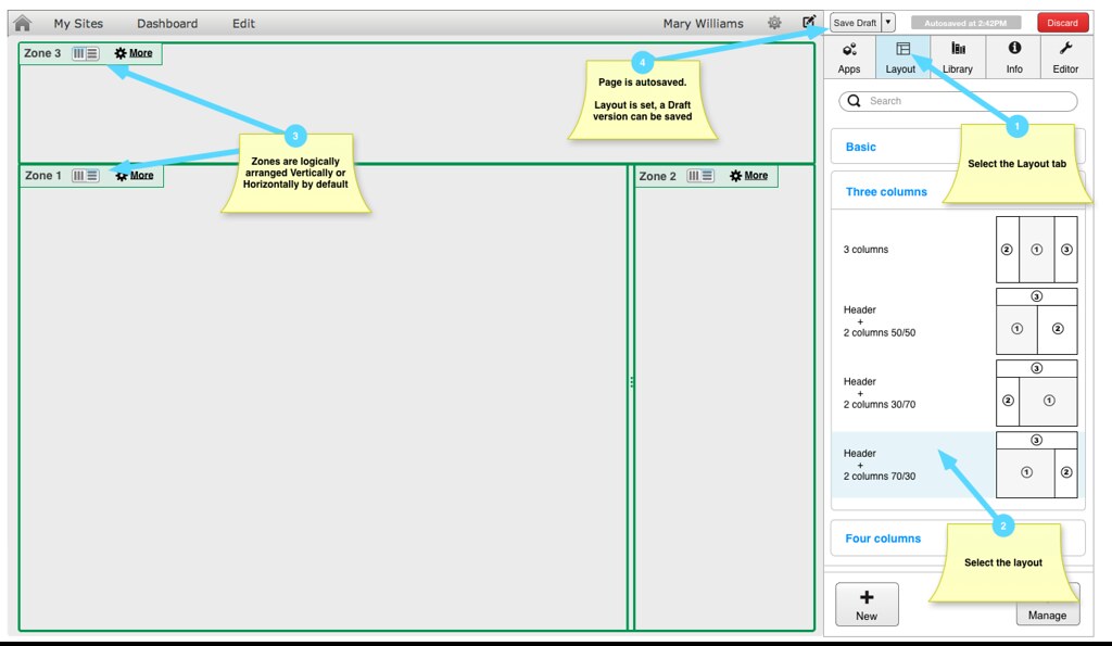
3.3.3 Selecting a layout
3.3.4 Adding an Image banner
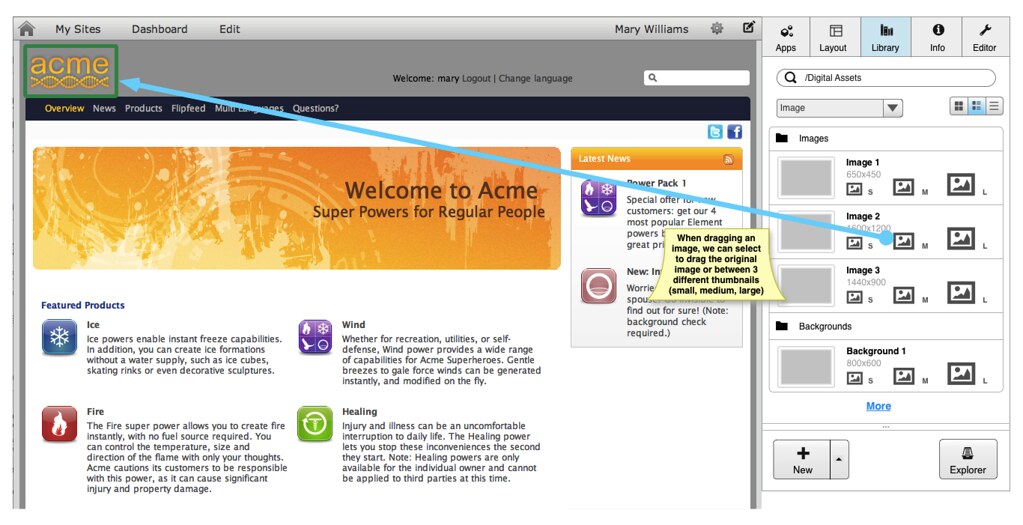
3.3.4.1 Adding existing image from the Library
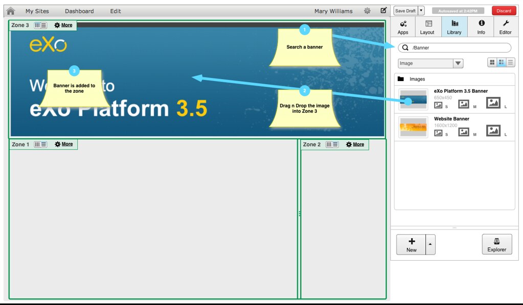
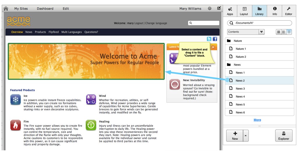
As said before, we can directly add an image in a zone. Contents are first class citizen inside a page.
3.3.4.2 Adding a new image
We can either add an Image Application or upload a local image.
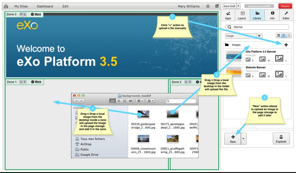
There are multiple ways to upload a new file in a page.
- Using “+” action : this action displays a Drop down popup with a select button
- From the Desktop, drag a file on the Folder area, it will automatically upload it using HTML5 Upload events.
- Some files, like image, text or html files are first class citizens inside a page. We can also drop a file inside a zone, it will be automatically uploaded and added in the page. File is then stored as part of the page.
- For legacy browsers, we can also upload a file using the “New” action.
Upload from Desktop in a zone will only accept files that are first class citizen in the portal. Thus, we accept Images (png, jpg, gif), Text files (txt) and HTML files (.htm, .html). Behaviour for Text and HTML files is the same as Images
3.3.5 Adding Existing Contents
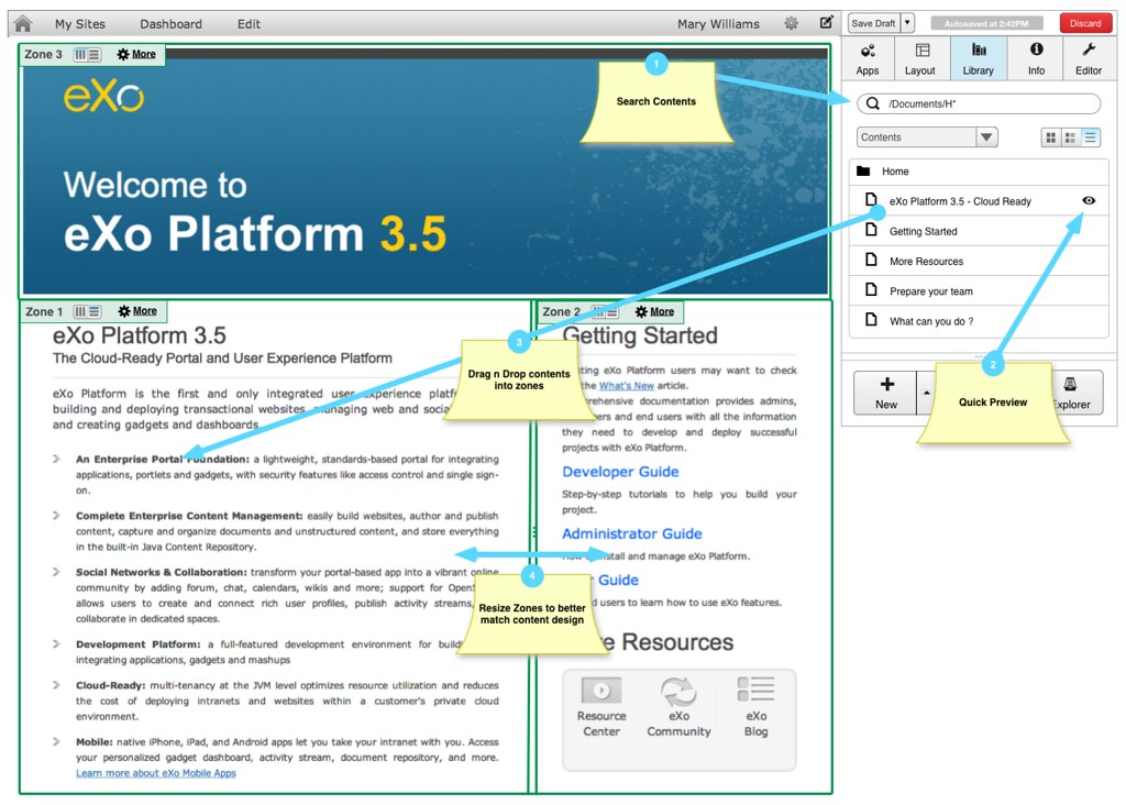
Adding contents to a page is as easy as adding an Image, we can also resize zones to better fit the contents even if we are in the Library tab.
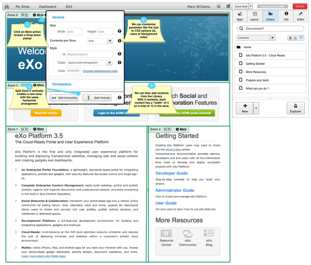
In the top zone (Zone 3), we can notice we miss a zone to put the 3 banners contents we have in the Design example. We can split the zone in the “more” Drop down panel.
3.3.6 Creating Content in the page
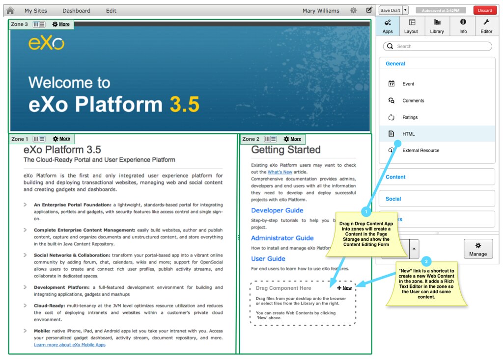
Inside each zone, we have a shortcut to create a new Web Content.
The help message in the “Drop zone” summarizes what is possible to do :
Drag files from your desktop onto the browser or select files from the Library on the right.
You can create Web Contents by clicking 'New' above.
3.3.7 Splitting a zone
Comments