Overview
The Mobile Web refers to browser based applications created for mobile devices, such as smartphones or tablets, which are connected wirelessly.
Since 2008, the web has shifted with a focus on mobile device browsers. Mobile browsers are delivering better user experiences and development platforms, due in large part to HTML5 and the W3C specifications which fall under it.
At this point, you’re probably headed in one of three directions:
- You wish to write a brand spankin' new Mobile Web only HTML5 based app
- You’re looking to create a new web application for both mobile and desktop clients, or
- You are converting an existing application to work on mobile devices.
To get to any of these destinations, it's important to understand the basics of the Mobile Web so that your application will work consistently across targeted platforms.
The Basics
Let's review the structure of a mobile web application to understand what is expected for any web app to go mobile.
Viewport Metadata
The viewport is the area in which your web page is drawn. You can define properties of the viewport for your web page using the "viewport" property in an HTML <meta> tag (which must be placed in your document <head>). You can also define multiple viewport properties in the <meta> tag's content attribute.
For example, you can define the height and width of the viewport, the initial scale of the page, and the target screen density.

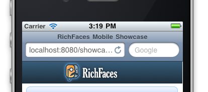
Here is the viewport setting we used for the RichFaces Mobile Showcase:
<meta name="viewport" content="width=device-width, initial-scale=1.0, minimum-scale=1.0, maximum-scale=1.0"/>
This allows the application to resize when rotated to landscape or portrait mode and zooms the content appropriately.
Other device browsers may support additional metadata. For example, Mobile Safari supports Apple specific Meta-Tag keys which allow you to set things like full screen mode and adjustments to other native look and feel elements.
<!-- enable full-screen mode -->
<meta name="apple-mobile-web-app-capable" content="yes"/>
<!-- controls the appearance of the status bar in full-screen mode -->
<meta name="apple-mobile-web-app-status-bar-style" content="black"/>
To get all the details on what is supported, checkout the CSS Device Adaptation specification.
JavaScript
In the RichFaces Mobile Showcase, we made use of as much screen real estate as possible while running in the device browser. To automatically hide the browser URL bar, our code calls the following JavaScript onload.
To automatically hide the browser URL bar, our code calls the following JavaScript on document load.
// Hides mobile browser's address bar when page is done loading.
  window.addEventListener('load', function(e) {
    setTimeout(function() { window.scrollTo(0, 1); }, 1);
  }, false);
Language Improvements
Many additional methods were added to the Array protoype in JavaScript 1.6. These are available in most, if not all, mobile web browsers. For example:
// Give me a new array of all values multiplied by 10.
[5, 6, 7, 8, 900].map(function(value) { return value * 10; });
// [50, 60, 70, 80, 9000]

// Create links to specs and drop them into #links.
['html5', 'css3', 'webgl'].forEach(function(value) {
  var linksList = document.querySelector('#links');
  var newLink = value.link('http://google.com/search?btnI=1&q=' + value + ' spec');
  linksList.innerHTML +=  newLink;
});

// You can also use these extras on other collections like nodeLists.
[].forEach.call(document.querySelectorAll('section[data-bucket]'), function(elem, i) {
  localStorage['bucket' + i] = elem.getAttribute('data-bucket');
});
Device Detection
When building a mobile application, best practice dictates a mobile friendly URL for our users to hit. There are a few options to detect the device which is currently browsing your site so that you can redirect your user to the appropriate mobile URL.
1. Parse the User Agent yourself and write some wild regex to detect the browser.
2. WURFL
3. MobileESP
Here you see a custom MobileESP processor with CDI integration:
@ManagedBean(name="userAgent")
@SessionScoped
public class UserAgentProcessor implements Serializable {

    private static final long serialVersionUID = 1L;
    private UAgentInfo uAgentInfo;

    @PostConstruct
    public void init() {
        FacesContext context = FacesContext.getCurrentInstance();
        HttpServletRequest request = (HttpServletRequest) context.getExternalContext().getRequest();
        String userAgentStr = request.getHeader("user-agent");
        String httpAccept = request.getHeader("Accept");
        uAgentInfo = new UAgentInfo(userAgentStr, httpAccept);
    }

    public boolean isPhone() {
        //Detects a whole tier of phones that support similar functionality as the iphone
        return uAgentInfo.detectTierIphone();
    }

    public boolean isTablet() {
        // Will detect iPads, Xooms, Blackberry tablets, but not Galaxy - they use a strange user-agent
        return uAgentInfo.detectTierTablet();
    }

    public boolean isMobile() {
        return isPhone() || isTablet();
    }
}
Then, in our Facelets template, we determined which page should be shown through Expression Language.
<f:view
      xmlns="http://www.w3.org/1999/xhtml"
      xmlns:h="http://java.sun.com/jsf/html"
      xmlns:f="http://java.sun.com/jsf/core"
      xmlns:c="http://java.sun.com/jsp/jstl/core"
      xmlns:ui="http://java.sun.com/jsf/facelets">

    <c:choose>
        <c:when test="#{userAgent.phone}">
            <ui:include src="phoneHome.xhtml">
                [phone]
            </ui:include>
        </c:when>
        <c:when test="#{userAgent.tablet}">
            <ui:include src="phoneHome.xhtml">
                [tablet]
            </ui:include>
        </c:when>
        <c:otherwise>
            <ui:include src="desktopHome.xhtml">
                [desktop]
            </ui:include>
        </c:otherwise>

    </c:choose>
</f:view>
Performance
Reduce network requests, save bandwidth
It's a known fact that reducing the number of HTTP requests can greatly improve performance. Mobile devices further limit the number of concurrent connections the browser can make, so mobile sites will benefit even more from reducing these extraneous requests. Furthermore, shaving off every byte is critical because bandwidth is often limited on phones. You may be costing users money!
Conclusion
If that wasn't enough in your quest for mobile web knowledge, I highly recommend you check out Mobile Web Application Best Practices from the W3C. It collects the most relevant engineering practices, promoting those that enable a better user experience and warning against those that are considered harmful. For example, it explains how to use WebStorage to automatically authenticate returning users, along with other tips like compressing data which is delivered to the mobile device with gzip.
For more AeroGear specific information see:
References
Comments