Hi,
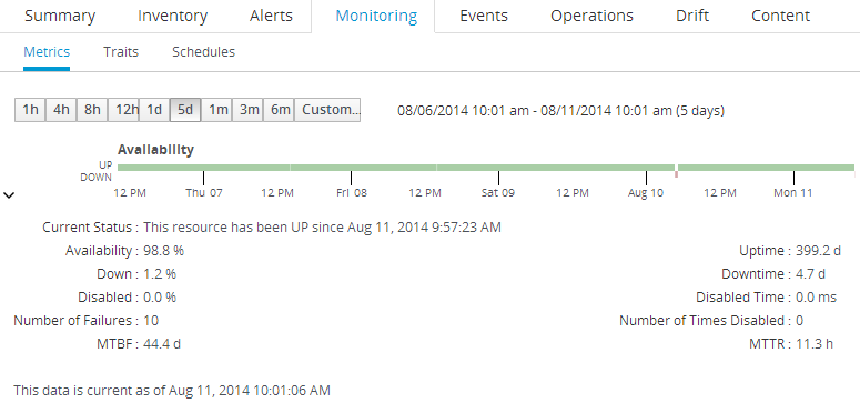
since the new graphs the old Availability screen is replaced with a green bar showing availability.
This is good but it has one major problem, in that it is really hard to 'hover' over a point in time and find the details for how long a server/resource was down.
In short: I miss the old table view of avilability and wondering if there is any way to bring this back? For instance when opening the details view (Uptime, MTBF etc). In fact, the hover text says "Click here to view additional tabular data" so it would be logical to find the same old table here.
Very good feedback and suggestion. Thanks