This content has been marked as final.
Show 5 replies
-
1. Re: Web Management Console in JBoss EAP 7.0 Alpha is annoying
heiko.braun Nov 14, 2015 8:23 AM (in response to jorsol)
There is a known issue that css files are not loaded correctly, when switching from EP 6.4. Could it be that you experience this problem? A clean cache browser reload fixes it.
-
2. Re: Web Management Console in JBoss EAP 7.0 Alpha is annoying
jorsol Nov 16, 2015 10:52 AM (in response to heiko.braun)
Sorry for the late response Heiko, but no is not that issue. I clear the cache and start in private mode but it's the same...
Let me try explain with images:
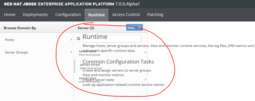
1) This is obviously a bug, in the configuration tab click the Related Links:
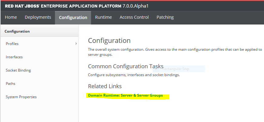
And you come up with this:

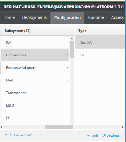
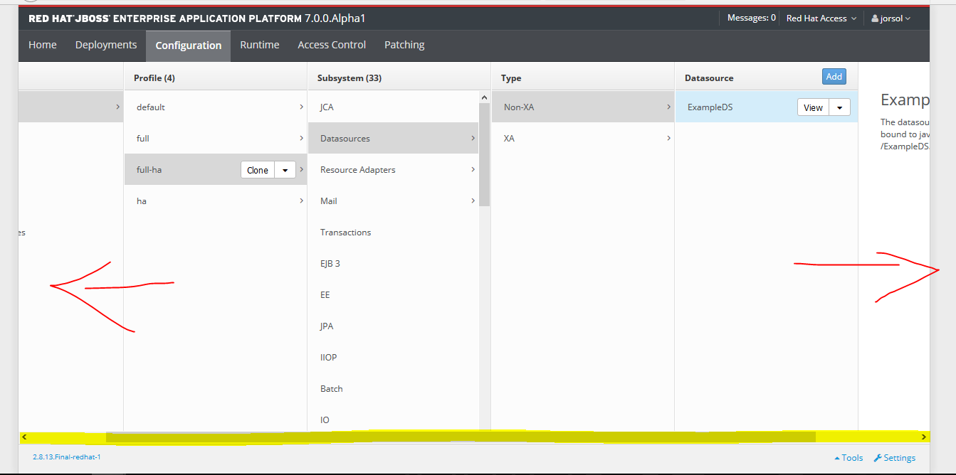
2) Do I have to scroll horizontally, this simply don't look right, even with a 1920x1080 resolution it's simply wrong.
3) And if the idea is to follow a mobile UI, it should be responsive web design, not like this:

4) Do I really need to go to another page to see the content that before was shown on the same page?
I'm not a pro in this kind of stuff, but for me is just annoying.
-
3. Re: Web Management Console in JBoss EAP 7.0 Alpha is annoying
heiko.braun Nov 16, 2015 11:34 AM (in response to jorsol)
Thanks for the feedback. Let me go through your points one by one and to comment on it:
1) Looks like a plain bug.
2) In some cases you to scroll horizontally. That's a design rational I can explain in a seperate thread if you like.
3) It's not intended to be responsive, although I can understand why it may create this impression.
4) I don't really understand what you mean here.
In general I expect that many 6.4 users find it irritating to use in the beginning. This can be partially explained by the habits of using and the familiarity with the previous design. But overall the new design addresses many of the previous limitations and I believe it just takes time to get adjusted.
-
4. Re: Web Management Console in JBoss EAP 7.0 Alpha is annoying
jorsol Nov 16, 2015 12:09 PM (in response to heiko.braun)
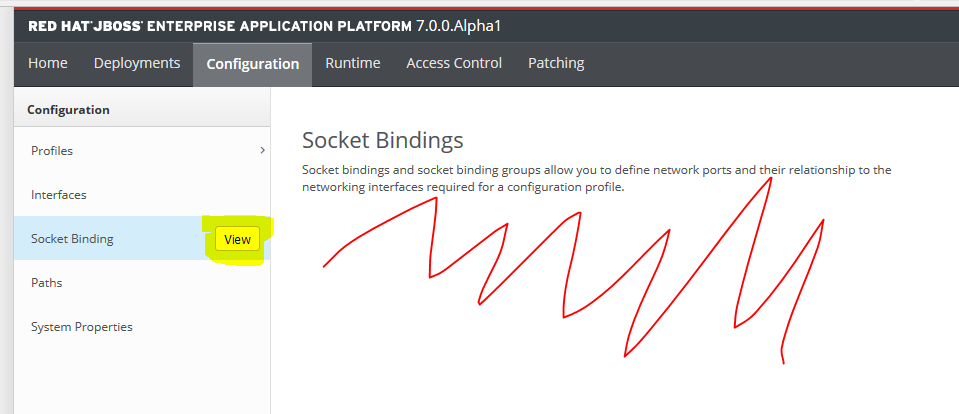
In the 4 point I don't really understand why I have to click on the view button and open up a new page when there is space available to the right in the description wich can hold the settings, but I guess is part of the new design.
I would like to understand the design rational behind this, and what are the previous limitations that are addressed with this new design.
Sure, after some time I can accommodate to the new design, but it simply don't feel intuitive, maybe it's just a matter of time to improve it like with 6.0 -> 6.4.
-
5. Re: Web Management Console in JBoss EAP 7.0 Alpha is annoying
adila01 Nov 16, 2015 2:27 PM (in response to jorsol)
I have to agree with Jorge here.
The new design seems to follow a "fan" UX pattern that has all but died off. Plus, it seems like the old pages and the new design have been kludgey combined together. There seems to be a lot of consistency issues that were partially mentioned by Jorge. The old design had its own issues, but at least it was more easily discoverable and relatable since it followed a similar approach to what other application servers were doing. Personally, I think Keycloak got it right when it comes to displaying a lot of configurations in a natural way as well as keeping it mobile friendly.