This content has been marked as final.
Show 1 reply
-
1. Re: Dashboard interval settings
jayshaughnessy Mar 28, 2016 11:07 AM (in response to karthikraj)
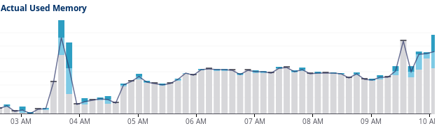
Graphs break up and smooth the data to, I think, 60 buckets for the given time range. So unless your time range matches the raw data in just the right way you won't see a graph bar for each raw data point reported. In your example, the graph covers about 7.5 hours, or about 450 minutes. With 8 minute buckets we can see 8 * 60 = 480 minutes, so that's a quick estimate that shows why you are seeing what you're seeing. If you hover over the graph you should see hi/lo/avg (I think) for that bucket, which should also make it clear that it's not a single data point but rather a time bucket.