1 2 3 Previous Next 33 Replies Latest reply on Jun 3, 2012 3:40 PM by antoine_h

    Administration UI

    theute

      I think we can improve tremendously the admin parts of GateIn, here is a little something I wrote while waiting on a plane waiting on suggestions for improvment.

      It starts with the various admin UI parts we have and also contains some ideas for improvement. The main goal would be to have a much more unified application, a single place for administrators and content editors to manage the portal.


      Actual state

      Application registry

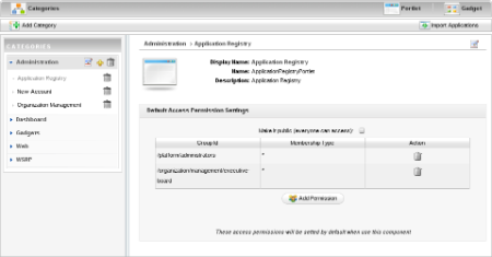
      Application registry manage categories of applications where portlets and gadgets can be classified.

      Access permission to categories and applications define if they are available to build a page from the mini-composer (including dashboard pages).

      Categories purpose is to classify applications.

      “Import applications” is a development feature and may be removed from main interface.

      It could be interesting to add version of the deployed application as this info should already be available for portlets and gadgets.

      There were ideas to extend the notion of applications to other kind such as a WCM content for instance, a list of articles for a specific tag or customized portlets (such as an iFrame portlet for Google.com and one for facebook.com). This would be more similar to EPP 4.3.


      appregistry.png


      Page Management

      Pages are the visual components of a web browser page. All pages of a site have the same template (Applications that are surrounding a page).

      There are three types of pages:

      “portal” pages, those are shared by all users and belong to a specific site.

      “group” pages, those are shared by all users of a group

      “user” pages, or dashboard pages only for a specific user. (Those are not listed anymore as they may be  too many and it has very little to no value to be listed here).

      The only interests of this app is to be able to delete a page and to modify a page without being on that page.

      pagemgmt.png


      Site export/import

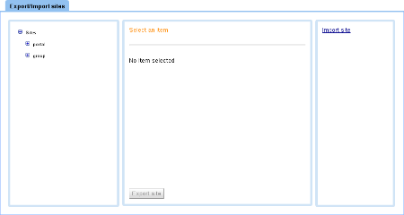
      This application is not using WebUI but GWT with default skin. It allows to export or import a site to XML files.

      It would be prefer to integrate that feature directly from a place where sites can be edited.


      expimp.png


      Services Management

      This is a new app which is also not using WebUI, it's using standard portlets with jQuery.

      It allows to operate some very advanced features such as deleting caches. It is mostly used to workaround issues if any or in development mode.

      This could probably be replaced and use more of AS7 great admin features...


      servmgmt.png


      WSRP

      This app allows to add consumer and producer configuration.


      wsrp.png


      Organization New staff

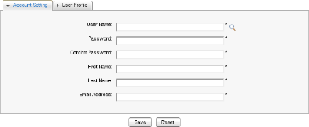
      This app allows to create an account for a user, used when an administrator wants to give username and password to someone without having this person to create his account himself.

      This feature should probably be merged with the organization user and group management application.


      newuser.png


      Organization User and group management

      This allows to see and define users, groups and the relationship between a user and a group (a member of a group would usually have less rights than a manager of a group)


      org.png


      Site management

      This part is accessed by clicking on “Site”, it should be along with the other administrative elements.

      The application allows to create new sites, to edit some of its configuration and also their navigation nodes (the hierarchical links to pages). There is also a convenient link to edit the layout of a specific site.


      sitemgmt.png


      Group site management

      Similarly to portal site management, the group site management allows to create sites for some groups.

      groupmgmt.png

      “Rough idea”

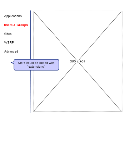
      We should be able to merge some of the applications into 5 sections or so, this should make it easier to find how to achieve something.

      There could be sections added by deploying other parts (for instance an SP admin section or the WSRP section that is already listed here).

      The app needs to be very responsive and helping the user (autocomplete...).

      prop.png

      "Things"

      Applications

      Equivalent to the existing application registry

      Users and groups

      Ability to manage, users, groups membership including creating new users.

      Sites

      To manage pages and navigation nodes, including rules to do redirections between nodes for mobile requirements for instance

      WSRP

      The same features as of today

      Advanced

      For the Services Management part and maybe some stuff oriented for AS7
        • 1. Re: Administration UI
          gcardoso

          I'm working on the Admin's UI and had some ideas I would like to share with you to see if they are feasible so I can keep going in this line. The main idea is to have a particular interface for the Administration where both Admin and Content Manager can perform their tasks.


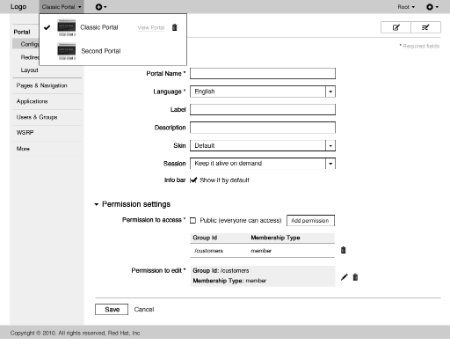
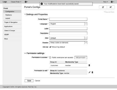
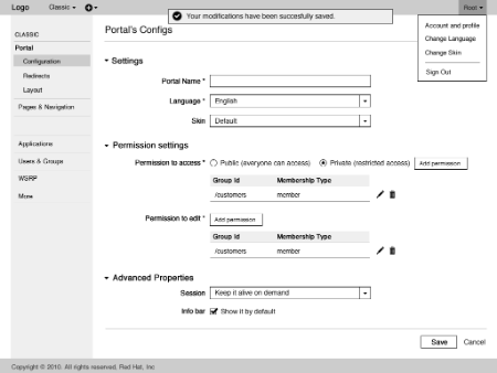
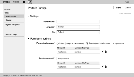
          The first big change is to separate the admin's and portal's interface. So when the Admin enters, he doesn't see the homepage anymore, but a Admin interface, wich is more useful to him. To see the Portal, he needs to click  "View Portal" under "Classic Portal" at the top bar. By putting that selector at the top bar I'm suggesting that the changes made in the Admin are only for the "Classic Portal". If he wants to make changes related to another portal, he needs to select this portal in the top bar at first. This way we reduce the information load in some pages (e.g. Page Management) and make him focused in doing one Portal management at a time.


          admin1.gif

          Another important change is the replacement of some modal boxes (pop-ups) to pages. Pages like Portal's Config  works better in a page because in this new proposal because user does not loose context. Also the required fields are easily visible (since they are not spread in different tabs) and we solve the problem that sometimes a feedback talks about a required field that is not visible at that time because it is in another tab.


          The mockup makes easier to the user to find out where he is since a big title is displayed and the sidebar presents the opened link as active. The title and the buttons Edit page and Edit Layout (top right) are fixed at the top and always visible. In pages with forms where user needs to save / cancel changes, these buttons should be always visible in a fixed bottom.


          admin2.gif

          Some action were regrouped at the top bar. At the side of the Portal name is possible to Add a New Portal / Add a New Page. Links like Account Info and Sign Out were put under the username. Change language / change skin were put under the settings icon so the Logo can be used as a link to the homepage.


          admin3.gif


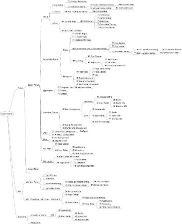
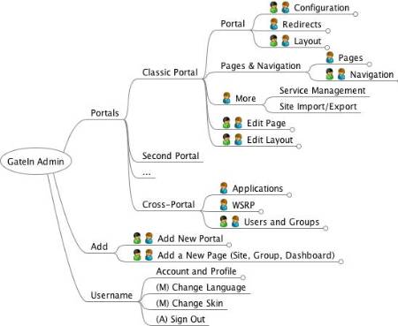
          My proposed sidebar organization can be shown in the Admin's Information Architecture Blueprint and follows some ideas proposed previously by Thomas. I basically propose the following groups:

          - Portal: old "Edit Portal's Config"  + "Edit Layout" + new "Redirects"

          - Pages & Navigation: old "Page Management" + "Edit Navigation" related to Portal, Groups and Dashboard

          - Applications: same as "Application Registry"

          - Users and Groups: old "New Staff" + "Users and groups management"

          - WSRP: same

          - More: Service Management + Site Import/Export + New features…


          User pages like Homepage, Sitemap, Sample-Ext Page, My Link and Dashboard are presented only in the portal (view Portal).


          New IA Admin.jpeg

          • 2. Re: Administration UI
            theute

            Great stuff to start with


            Few comments on the existing wireframe:


            I don't think we should redirect someone with "admin" privileges to a different page but just make it easy to get there. Anway this part is minor.


            Some operations are accross portals and some are specific to a portal. For instance user and group management are not dependent on which portal (Site) is being edited, same for WSRP. So do we really want to have that selection as top level ? (in fact I think only pages and navigation nodes management is specific to a site).


            "Session" information and to some extend "Info bar" are quite "advanced feature" do we want to hide them in a folded section ?


            Permissions to Edit is currently limited to 1 permission via the UI, but in the new UI we will want to let have multiple ones (should be fairly easy to implement as the storage is already prepared for that by Julien)

            • 3. Re: Administration UI
              stevan_lemeur

              Hi Gabriel,


              I've got some feedbacks about your mockups. There are interesting but some things can be improved IMO, to make the interface clearer for users.


              Here is about your first screen :

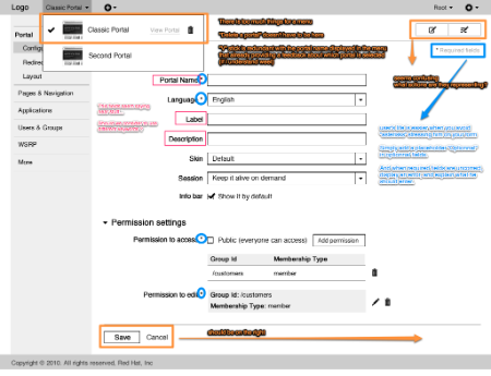
              * In the navigation bar, there is quite a lot of things… I don't think "delete a portal" feature has his place in this menu.

              * "Portal Name", "Label", "Description" are providing similar sense. It should be more precise to help users to understand differences in form fields.

              * required fields are highlighted with asterisks. I think it's stressing any user in any form doing stuff like that. The solution is to use a placeholder in optionnal fields. (It's an uxp rule)

              * about "save" and "cancel" actions, it's true that depends if you are Mac user or Windows user, but we should stay consistent everywhere. For now we align them on the right !

              * buttons for "edit page" or "edit layout" are not clear. I think labels might be necessary...


              skitched-20120425-175213.png


              Good idea for modal boxes. I like it !


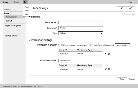
              About the navigation bar, I think it can be improved by :

              * avoid using redundancy in key actions : in "Add New Portal" and "Add New Page", "Add New" add some useless noise

              * root and options might be merged.


              skitched-20120425-180531.png


              Feel free to contact me if you want to discuss.

              • 4. Re: Administration UI
                gcardoso

                Thanks Thomas!

                I do believe we should present the Admin's page to the Admin at first if the managing tasks are more often than browsing the site. But you guys are more familiar with the product to tell me about the Admin's goals or we can do a quick research.

                I'll think about a solution for the Portal selection to remove the inconsistency of some actions being cross-portal and also think about a solution for multiple permissions to edit.

                • 5. Re: Administration UI
                  gcardoso

                  Hi Stévan. Nice to have a feedback from a designer. I agree with some feedback but I'm not sure about the following topics:


                  - Portal selection: I'll need to think about another solution for the portal selection anyway but I'm curious to know why "Delete portal" should not be there.

                  - Required fields: I've read that optional fields should be pointed when the screen presents less optional fields than required ones (not this case) and I've been seeing * as a stronger pattern. Do you have the source of this UX rule?

                  - Edit page + Edit layout: Those icons are not final (will be refined) and the idea is to provide a tooltip for those actions. I don't want to add more text and pollute that area so I prefer that users explore the button and learn what they mean, following the Alan Cooper's advice to optimize to intermediates.


                  Thanks

                  • 6. Re: Administration UI
                    kenfinni

                    For the new Admin UI, I believe it would be beneficial to remove the ability to edit page nodes for the Admin pages.


                    With a move to a more modular Admin UI, whereby modules are auto discovered and added to UI, I don't feel that there is a need to support editing of those pages.  Providing the ability to edit the pages would hinder the goal of making it more structured under specific headings.


                    Besides, how often is someone going to be modifying the Admin UI?


                    Ken

                    • 7. Re: Administration UI
                      julien_viet

                      Hi Gabriel,


                      the biggest issue I have with your mockup is that it mixes two kind of roles which don't have the same meaning


                      • publisher (as in WCM / EPPSP) which cares about how the portal is used to present content or portlets
                      • administrator (as technical person) that cares about how the portal is configured and focus on low level administration


                      Let's take an example of the portal config:


                      • publisher cares about the skin, the portal display name, etc...
                      • administrator cares about low level concern such as "keep alive session" for instance


                      Mixing the two kind of concern in a single administration screen creates confusion and also is error prone as one role may change a portion of the configuration he should never change.


                      (I may have some other concerns later)

                      • 8. Re: Administration UI
                        julien_viet

                        my actually biggest issue is that you talk about removing popup (which are actually sometimes bad) and they should not removed all the time, which means that my answer "yes and no":


                        • technical administrator need what you have designed: a centralized view of the administration
                        • publisher administrator (or content administrator as you say): they often need to configure something they are actually seing or using


                        Hence what you have designed certainly makes sense for a centralized administration, however removing contextual administration (popup) would certainly be a regression in term of use case of administration. However I think that the current contextual admin should be simplified. For instance:


                        • configuring "keep session alive" does not make sense
                        • some contextual admin is heavy weight and generates too much config or wrong config
                        • 9. Re: Administration UI
                          stevan_lemeur

                          I will try to explain my point of view for :


                          • "Delete Portal" in Portal selection :


                          Deleting a portal might be a critical action from the user but also not oftenly used, so it must not be too easy to access IMO. My second point, is that you put at the same level "navigation" and "action" and it can add some confusion for the user.


                          • Required fields :


                          I've read this article. I understand your idea, but who will be users of these Admin features ? I think it will be premium users (Admins or Content Managers), so at least, I think you can remove the part "* Required fields" (and remove some noise here ).


                          • Edit page + Edit layout :


                          Probably I didn't correctly understand the meaning of these features and why there are directly put at the same level as Portal Administration ?

                          Do they are relative to edit one particular page/layout ? In this case, they are key features of Portal IMO, so a Content Manager user should use them oftenly and he must find these features very quickly and easily, without having to learn the UI no ?

                          Perhaps I didn't understand clearly what is behind these buttons, can you describe a little ?

                          Good idea to apply Alan Cooper's advices to optimize UI for intermediates users, but you should find good icons ! good luck it will not be easy ;-) !


                          Thanks for your reply Gabriel !

                          • 10. Re: Administration UI
                            theute

                            I agree with Julien's concern about mixing roles, even though I mentionned in my orginal question that for me it should be a single place for administrators and content editors to manage the portal.


                            The thing is that in some scenarios it will be the same people and in some it will be different people. Also some parts can be argues in which category it falls (for instance the "Applications" part). The main parts of the UI should be displayed/hidden depending on security rules so you can show or hide part of the UI depending if the logged-in user is an "admin" or "content editor".


                            For things like "keep session alive" it may need to be an extra "extension" for advanced administrative parts. It could also be the place to setup things like time to live for a cache... I wish we had something like "about:config" in Firefox which lets the user setup such "details" if they know what they are doing (recommended by support team or explained in doc).

                            • 11. Re: Administration UI
                              gcardoso

                              Hi people.


                              After your comments, I ended up with other wireframes for the GateIn's admin. I'll try to explain my point of view for every comment.


                              Julien's Viet concern about mixing the two kind of roles (Admin / Content Manager) in the same screen is critical for the evolution of the concept. By taking a look at the current Admin it's possible to see that the Admin can access everything the Publisher does. So the mockups I posted were about the Admin's view. As Thomas said, the idea is to present to the Publisher only the sections he can edit in the same interface. My reason to not offer a different interface for the Content Manager is that he performs the same tasks as a Admin can perform but without some privileges. So in cases like that, it's recommended to design for the Admin and optimize for the Content Manager (only showing to him the areas he can Edit). If I understood well, the Admin will stay more at the Admin's interface and the Publisher will be both in the Admin's interface (e.g to manage users) and in the Portal's interface (to edit portlets / content in pages) so that might work. In Admin's interface, the Publisher would see something like the attached image.


                              publisher1.gif

                              And the New Admin's Information Architecture Blueprint based on the permissions currently existent. The blue man is the Admin and the green one is the Content Manager:


                              New IA Admin.jpeg


                              Ken is not sure if the Admin should be able to edit page nodes in the Admin's pages. If we believe that our admin is good enough at a level to not require any customization, so I agree with him. Otherwise, maybe we should let them edit their Administration area. Thoughts?


                              About the idea of minimizing the page modals, I agree that those modal boxes are useful in many cases (but not in all cases that it is currently used). So I intent to keep some pop-ups (e.g. Change Language) and replace the complex ones by pages that don't need to keep the context.


                              I also tried to make more explicit which operations are specific to a portal (under Classic) and what are accross portals (at the bottom). Unfortunatelly I didn't find a better place than the top bar to put that selector and I believe it's not gonna be confusing with the label in the sidebar.


                              admin3.gif


                              Now it's also possible to give permission to edit for multiple users. Username / Settings were merged as Stévan suggested.


                              To reduce the number of fields of the Portal creation / settings, I removed the fields label / description. I believe the Admin will survive without them by giving meaningful titles for their Portals. Please let me know if they are crucial


                              I also put "Session" and "Info bar" under the folded section "Advanced Properties" that are only available to the Admin.

                              • 12. Re: Administration UI
                                julien_viet

                                quickly replying:


                                one thing you don't get is that publishers don't go in a centralized admin to edit a portion of the configuration they need.


                                they use contextual configuration of the part of the related entity they are viewing: for instance they are viewing a page they click on a button and they can configure what it is relevant to them without changing the current navigation. This configuration only show the information they need to do their work.


                                Hence the existing popups that you want to remove (for some unknown reason) and shove in the centralized configuration is a fundamental mistake you are doing.


                                However this does not preclude to have a centralized view with everything as view plugin as thomas suggested and as you are trying to leverage.

                                • 13. Re: Administration UI
                                  gcardoso

                                  Hi Julien. I think I got your point and we are saying the same thing. My idea is not to remove all pop-ups neither to make the Content Manager try to edit content / portlets from a centralized admin but to make some pop-ups as pages (e.g. Portal's config) when context is not necessary and offer the Admin's interface when he needs to manage the Portal (not configure a page) (e.g. to manage users and groups). The scenario I thought to the Content Manager is the following:


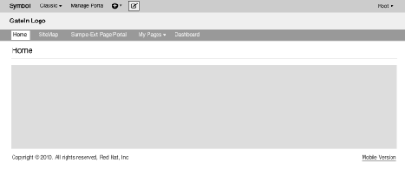
                                  1) Publisher logs in the Portal and sees the homepage.


                                  publisher1.gif


                                  - The top bar shows that he is seeing Classic and he can change the portal.

                                  - Manage Portal takes to the admin interface (Administration and Organization…)

                                  - The menu item "Group" was removed, replaced by My Pages (current User's Pages under Group). Maybe it could be integrated to the Portal NavBar? Just a proposal...

                                  - Site editor was replaced by Add Page and the button Edit Page


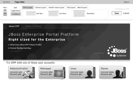
                                  2) Publisher decides to edit the content, so it clicks the button Edit page (top bar)

                                  publisher2.gif


                                  - Buttons Save / Cancel are prominent

                                  - Page Editor could be integrated to the page. That would be better for users who don't have large screens (so the pop up does not stay in front of the content).


                                  3) He saves the changes and decides to edit some portal information / users so click in Manage Portal.


                                  publisher3.gif

                                  • 14. Re: Administration UI
                                    julien_viet

                                    This is clearer now thanks for clarifying that.


                                    I think that Thomas initial idea about the centralized admin is great, however I think also that the current work you are doing is too much preliminary as we have not yet time to discuss about the evolution of the UI at an high level.


                                    We all want to make the UI evolve to handle new features and the current work you are doing cares about the existing without the forthcoming evolutions (explaining why it is preliminary): what you are describing in 2/ will be deprecated as we want to change the UI ("we" as the idea we put in the PRD agreement).


                                    I think both parties (exo and RHT) have strong opinion on UI (and RHT more since you joined the team) and we have a product to build together. It would make sense to me that we spend time together to discuss about this, from eXo side probably me (involved at the UI and technical level) and Stevan (invovled at the UI level) at least.


                                    However this does not involve all the admin UI:


                                    For instance the organization service user interface is not under my consideration as it is decoupled from the portal UI. It's certainly something you could look at that is much less impacted by the forthcoming PRD stuff. As a side note: I started to work on a UI prototype using Juzu Web Framework, the goal is not to be the next GateIn organization management portlet but more a sample portlet using Juzu to prototype advanced UI techniques (JS / CSS) and also provide a powerful organization service UI (but at the expense of not being the most intuitive for noob). If you want to talk about this in another thread, don't hesitate.

                                    1 2 3 Previous Next