All Places > GateIn > Blog > Authors
mwringe
Some updates on what is happening on the mobile front with GateIn. We now have user agent (ie browser) detection and can configure site redirections based on that. Woot!
If you are using GateIn 3.4.0, you may already notice some changes:
- If you access the site using a mobile browser, you will be automatically directed from the default classic page to the new "mobile" page. Ok, the ‘mobile’ site isn’t really mobilized yet in terms of mobile optimized html, javascript and css, this will be coming in a future update. But the device detection and redirection part is up and running. Try accesing the default portal using different devices and see for yourself.
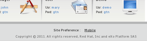
- You may also notice a new site preference portlet at the bottom of the portal page. This allows users to select which site preference they want. So if a user decides they don’t want to be redirected to the mobile page, thats cool, they can just click on the site preference portlet and be taken to their site of preference. And since their preference is stored in a cookie, their choice is remember on each subsequent visit to the site. No redirects? Thats fine, the portlet will remain invisible on the page if there isn't any.
A few caveats through:
- Its currently only configurable through the portal.xml configuration file, and there is no gui (yet) for the configuration. So its not going to be the easiest things to configure right now.
- As already mentioned, mobile optimized html, js and css is not there yet and will be coming in a future update. Yeah, this sucks and takes a away a lot of the functionality of a mobile iniative, but GateIn's skinning engine is powerful enough and should allow people to create their own awesome mobile enabled portal skins until we get a default mobile skin up and running. The skinning engine should also be updated in a newer release to handle some of the unique requirements of mobile development (like skin specific javascript and meta tags).
Stay tuned for future updates.
So lets focus on what is working and available today:
User Agent Detection
We can detect the user agent (ie browser) the current is currently using to access the site using the contents of the user agent string passed in from the browser itself or redirect to a special page to check the capabilities of the browser (for things like pixel density and touch event support). Can both be used together or separately, and uses things like regular expressions to give it some power.
Site Redirection
Ok, so we now know how to detect a user agent, now what? Well, the next steps is configuring the portal to redirect between the normal site and an 'alternative’' site (I guess we could call it the 'mobile' site here, but since we don't have a mobile ui done yet, its a bit getting ahead of ourselves). We support mapping specific nodes between the different sites as well as various strategies on how to handle nodes which don’t exactly match up.
And how do you configure all of this? Check out the docs available here: Gatein Device Detection and Site Redirection Configuration
Thats it for the mobile updates for now, stay tuned for future updates!