Skip navigation

GateIn

4 Posts authored by: gcardoso

On the 13-16th November the "Interaction South America" conference occurred in Recife, Brazil. The ISA is the biggest event of Interaction Design with this year's theme being "New models, new industries, new interactions". The conference consisted of four days of papers, cases, workshops and lectures with big names like Bill Buxton, Jared Spool and Lou Rosenfeld.


I presented a case describing my experience on working for an open-source project, the proposed redesign for GateIn, and the advances of the Red Hat Common User Experience initiative. There were about 50 people attending. On top of cases, papers and lectures, I attended to the workshop "Lean UX: Agility Through Cross-Functional Collaboration", with Josh Seiden, co-author of the book "Lean UX: Applying Lean Principles to Improve User Experience". Below you can see an overview of interesting points of the event.


Lean User Experience (UX)


Lean UX was inspired by the theories from Lean Startup and Agile development. Josh Seiden describes Lean UX as "a practice of bringing the true nature of a product to light faster, in a collaborative, cross-functional way with less emphasis on deliverables and greater focus on a shared understanding of the actual experience being designed".


As a case study, Josh presented a video where a team built an application to help sell glasses. They camped in a glasses store and developed an iPad application from scratch in less than a week; designing, testing and developing their app on site. Watch the video (click on it):


Screen Shot 2013-11-27 at 5.32.15 PM.png


There are 9 principles for Lean Teams (source www.luxr.co):

  • Design + biz + development + ... = 1 product team.
  • Externalize!
  • Goal-driven and outcome-focused.
  • Repeatable and routinized.
  • Research with users is the best source of information.
  • Focus on solving the right problem.
  • Generate many options & decide quickly what to pursue.
  • Recognize hypotheses & validate them.
  • Rapid cycles: think/make/check.


I'll comment some of them.


  • Goal-driven and outcome-focused: Instead of focusing in outputs (features), focus on outcomes (benefits). Do you need "chat" in your product (feature) or a better communication solution that fits your users' needs (outcome)? By jumping directly to features, you might ignore better possibilities to solve a problem.
  • Recognize hypotheses: Before adding any feature to your product, write down a hypotheses. E.g.: "We believe that a chat in our product will facilitate routine users, preventing them out of the product to communicate with a colleague".
  • Test hypotheses: Some of them need design, others don't. In the case above, some interviews could confirm the hypotheses. In case of some redesign, usability testing would fit better.


In the workshop, our team had the initiative to test a hypothesis with Josh Seiden. It was a redesign of a voice call app which I tested with him to see if he would complete a specific task easier and faster.

944311_689092461101184_130935258_n.jpg


The message of Lean UX is the following: instead of investing lots of money developing your revolutionary app, build something simple that can be tested by users. Launch a page with a concept and put a "Download" button. Thus, you will confirm if your idea is really interesting to the users. That's the spirit!

From 13 to 16 November there will be a big event in Brazil which will discuss interaction design, the "Interaction South America" conference. This is the biggest event of Interaction Design in South America, and will feature big names in the field such as Bill Buxton (Principal Researcher at Microsoft Research) and Louis Rosenfeld (co-author of Information Architecture for the World Wide Web), the bible of Information Architecture.


This year I will talk about interaction design at the conference, presenting the proposal of redesign I did for GateIn.


Screen Shot 2013-11-04 at 4.49.36 PM.png

My idea is not to talk only about the redesign process and its phases, but also about my experience collaborating to an open source project, something I'd never done before.


I will also talk about the Red Hat Common User Experience Initiative. For the ones who are not familiar with it, it's a project that aims to provide a common design for the Red Hat products. I'm contributing to it indirectly as I am using the proposed elements in a project, and suggesting new elements that were not designed. A console that uses the elements proposed by RCUE should look like the image below:


Screen Shot 2013-11-04 at 5.01.18 PM.png


So that is basically what I intend to cover at the conference. I'll write another post soon talking about how was it. Hopefully we see again soon

This year was the first time that JUDCon came to Brazil. The event happened on April 19 and 20, and was the first Red Hat Latin American Developer Conference. Mark Little, who leads the JBoss engineering team gave a keynote and announced the rebranding of JBoss As as WildFly.


The JUDCon 2013:Brazil presented nearly 70 sessions and had an attendance to 340 developers. Since talks about design are rare in this kind of event, I decided to submit mine, which was approved: Designing a New User Interface for Open Source Projects. In this post you can follow a little of what was covered in the presentation.


A project without a designer


I started saying that the User Interface of an Open Source project can suffer a lot without a designer. And that's not only related to visual design, but also to usability, the quality of usage.


Screen Shot 2013-05-02 at 12.55.31 PM.png


As an example, I shown the page of PECL, a repository for PHP Extensions. I guess they probably don't have a designer in the team... What do you think?


In the case of Gatein, some inconsistencies have been appearing over time. Do you see any reason for the login pop-up (in the left) and the login page (in the right) to be different?


Screen Shot 2013-05-02 at 1.01.25 PM.png

In this example, we can see inconsistencies of visual design (header, left image, colors, borders) and navigation design (the option "forgot user/password" and the possibility of getting out of the dialog is only available in the popup).


But how to avoid that inconsistencies and usability problems happen?


A design process for the Web


Instead of defining everything when you are ready to code the solution, how about following a design process that divides the problem in steps? That's what Jesse James Garrett presented in his famous diagram "The elements of user experience" in the early 2000's.


Screen Shot 2013-05-02 at 1.10.27 PM.png


He is basically saying that, after having the scope (requirements), it is needed to think about structure (flows and information architecture maps), skeleton (wireframes) and only after that go to the visual design. The next images show examples of this steps in the redesign of GateIn.


Screen Shot 2013-04-16 at 6.44.32 PM.png

Structure: fragment of the new Information Architecture proposed for GateIn


admin4.gif

Skeleton: Wireframe for the Portal Configuration page. The new design proposed the usage of more pages instead of pop-up dialogues.


Screen Shot 2013-05-03 at 8.35.39 AM.png

Surface: first proposal of visual design for the redesign of Gatein.


Where to start in case of a redesign?


Ok, that's the process of design. But where to start in case of a redesign? Specifically in GateIn, we wanted to improve visual design and usability. So my first task when I joined the development team was to conduct a usability inspection. To do that, I followed the Jakob Nielsen's 10 Heuristics for User Interface Design.


The outcome of this work was a spreadsheet listing the problems found. Usability inspection: fragment of the list with the usability problems found.


Screen Shot 2013-04-16 at 6.40.34 PM.png

Usability inspection: fragment of the list with the usability problems found.


Based on that, we could prioritize which pages to redesign first. The first one was the Portal Configuration page. After proposing a new Information Architecture for the portal and a new wireframe for the page, we went to the implementation of it in HTML and CSS.


Speeding up with Twitter Bootstrap


To accelerate the implementation, we decided to test Twitter Bootstrap, a front-end framework to speed up the development. The first implementation was done based on the wireframe, without having the visual design. We used only the HTML structure suggested by Bootstrap, without adding any line of CSS. The result can be seen in the next image.


Screen Shot 2013-04-17 at 11.17.46 AM.png

Our HTML with only CSS from Twitter Bootstrap.


Without any customized CSS, Twitter Bootstrap already provides a good header, nice buttons, a solid structure for the sidebar and well-designed forms, including tables. By adding a customized CSS with only 250 lines, we could achieve the result of the next image.


Screen Shot 2013-04-17 at 11.13.37 AM.png


It is interesting to say that, without Twitter Bootstrap, this design would need much more lines and time to be implemented. It needed only around 15 hours to look like this.


Although the interface was OK, we wanted something more special for GateIn. Based on this HTML prototype, we refined the visual design and reached the following result:


The redesigned pages were also implemented in HTML + CSS + jQuery, and can be seen at:


A mobile demo with Responsive Web Design


Since we planned on launching site redirects support for GateIn 3.6, we decided to offer a mobile demo with a design that works well in mobile devices.


Screen Shot 2013-05-02 at 2.13.32 PM.png

Mobile demo in a smaller screen.


Before being integrated to the project, it was implemented in HTML + CSS + jQuery, using Twitter Bootstrap too. The solution can be seen here: http://statichtml-theute.rhcloud.com/cardosogabriel/gatein-client/responsive/index-mobile.html. Try to reduce and increase the size of the window, or access it in different devices.


To make the original design responsive, I focused on two details:


Fluid widths and distances in percentage (%)


If you want to make the design fit the screen, you need to convert the widths, margins and paddings to "%" instead of "px". Here is an example:


Screen Shot 2013-05-02 at 2.20.13 PM.png


This makes the container (width of the page) fit 95% of the width of the device, instead of having a fixed width that would not fit all devices.


Break points


This is the magic of the Responsive Web Design. With break points you can declare specific CSS for specific dimensions. In the case of the Mobile Demo, I wanted the container to fit 95% of the screen for most of the cases. However, for smaller widths, I wanted it to occupy 100%, and for bigger widths, I wanted it to occupy 1170px as maximum. To do that, you just need to do declarations like these:


Screen Shot 2013-05-02 at 2.24.56 PM.png

Screen Shot 2013-05-02 at 2.24.22 PM.png


Conclusion


With this talk I wanted to show the design process that comes from the requirements until the HTML implementation. The full presentation can be seen at: http://www.slideshare.net/gabrielcardoso9/designing-a-new-user-interface-for-open-source-projects


GateIn was an excellent showcase, since its redesign followed the steps presented by Garrett in its diagram. Twitter Bootstrap provided nice UI components reduced significantly the time required to implement the solutions. Having applied the Responsive Web Design to the interface was exciting and made it look beautiful in many different devices.


I hope you have learnt something from this post. Stay tuned to the next GateIn releases. More design news are coming

Before I begin, I would like to introduce myself. My name is Gabriel Cardoso and I am the new GateIn's User Experience Designer. My role is to improve usability and user experience of the product. To encourage discussions on user experience, this will be the first of a series of posts about the theme.


If you are involved with the development of digital interactive products I am sure that you have already heard something about the term user experience. But what is this about anyway? Let’s forget a bit what we usually see over the internet and dig into the origins and evolution of the concept.


Introduction


User Experience has become a buzzword in the field of Human-Computer Interaction (HCI) and Interaction Design over the last decade [1]. The term was first published for the industry and academy in an article written by Norman, Miller and Henderson [2]  at CHI’95 -- Conference on Human Factors in Computing Systems. The article described the main aspects of research on human-interfaces made by Apple at that time, what the authors preferred to name user experience.


After more than 15 years from the first publication and despite the growing interest in user experience, it’s been hard to achieve a common understanding about it [3]. It's inventor assessed that this and other design terms “[...] just sort of entered the vocabulary and no longer have any special meaning. People use them often without having any idea why, what the word means, its origin, history, or what it’s about” [4]. Considering its broad utilization and its lack of understanding, let’s check out what has being said about user experience since its origin.


From its origin to the present


Since the first publication of the concept, many approaches have been described. They vary from subjective perspectives to project-centered ones, as well as an umbrella that put many disciplines together. In a research made for my Masters that covered 17 publications about the subject, it was possible to observe that the initial speeches tried to explain that user experience was more than usability and GUI (graphical user interface). Even Norman said: “I invented the term because I thought human interface and usability were too narrow. I wanted to cover all aspects of the person’s experience with the system including industrial design graphics, the interface, the physical interaction and the manual” [4].


Seven years later, Preece, Rogers and Sharp [5] brought a approach more focused on the user by declaring that  with user experience they mean “[...] what the interaction with the system feels like to the users. This involves explicating the nature of the user experience in subjective terms”. Marc Hassenzahl -- the author I know who more publishes on the subject -- also believes in an user’s perspective and have defined user experience as “a momentary, primarily evaluative feeling (good-bad) while interacting with a product or service” [6].


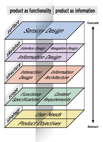
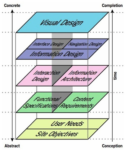
Maybe one of the most famous authors on the subject, Jesse James Garrett [7] became very popular with its diagram and book "The Elements of User Experience", that describes the design process to deliver a good user experience (figure 1). His elements are so popular that many people think of user experience as Garrett's elements. The diagram also reinforces the idea of user experience as an umbrella composed of many related disciplines -- in this case information architecture, interaction design, information design, interface design and visual design.


garrett.jpg

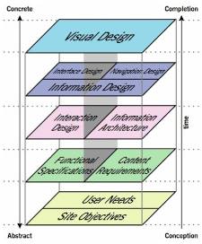
Figure 1: The elements of user experience [7]


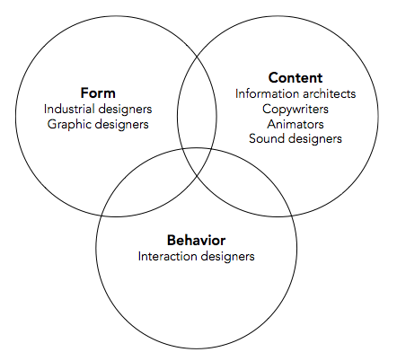
From the creator of personas, Cooper, Reimann and Cronin [8] also talks about the concept of user experience from the process perspective and as an umbrella too. To them, user experience design is an effort concerned with form, behavior, and content (figure 2). In their model, interaction design is more focused on the design of behavior, information architecture is more focused on the structure of content and industrial design and graphic design are concerned with the form of products and services.


cooper.png

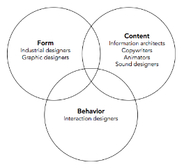
Figure 2: The three overlapping concerns of user experience design [8].


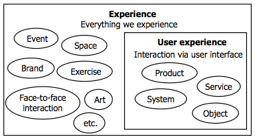
An important variable are the mediators. To Garrett, user experience is related to all kind of products and services, even a book or a ketchup bottle [9]. On the other hand, Law and colleagues [3] propose a more reduced scope that includes only products, services, systems, services and objects that people interact via user interface (figure 3).

law.png

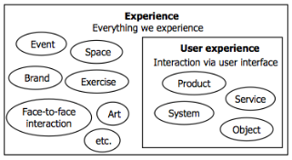
Figure 3: User experience in relation to other experiences [3].


On top of the concept and the mediators, authors seem to disagree about the temporal aspects of the user experience. Some defend that it happens only during the interaction while some others believe that it is related to before, during and after the interaction.


Making things clearer


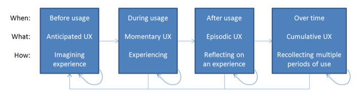
Attempted to clarify things, a selected group of 50 researchers and practitioners in user experience brought their different perspectives during the three-day seminar “Demarcating User Experience” that happened in Germany in September 2010. In the document the resulted from the seminar [10], they declared that user experience is not only related to during usage but also to before usage, after usage and over time (figure 4).


roto.png

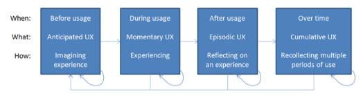
Figure 4: User experience phases and the terms that describe the related kind of user experience [10].


They also assessed that user experience is related to the user and influenced by three variables:

  • context: social context (e.g. working with people) + physical context (e.g. interacting with a device in a bus in movement) + task context (how focused on the task) + technical context (e.g. internet connection).
  • user: the motivation to use the product, they humor, physical and mental resources and expectations.
  • system: system character (e.g. functionality, aesthetics) + modified system properties (e.g. a background image) + brand.


Conclusion


Despite the broad utilization of the term user experience, its concept is interpreted in different ways and often misunderstood. While authors tried to explain that user experience was more than usability and GUI in the beginning, now it’s possible to see a more mature speech more concerned on the scope, mediators, temporal aspects and goals of user experience itself. Considering their different perspectives and many related elements and variables, it is still difficult to imagine an homogeneous discourse that addresses to the complexity of the concept completely.


Although there are divergences, it is possible to notice a predominance of an understanding that user experience is a subjective quality related to feelings and perceptions of the user in relation to products or services, the most cited mediators. From the scientific viewpoint,  reduction of scope proposed by Law and colleagues (figure 3) seems to be more interesting in order to allow a deeper understanding of the concept.


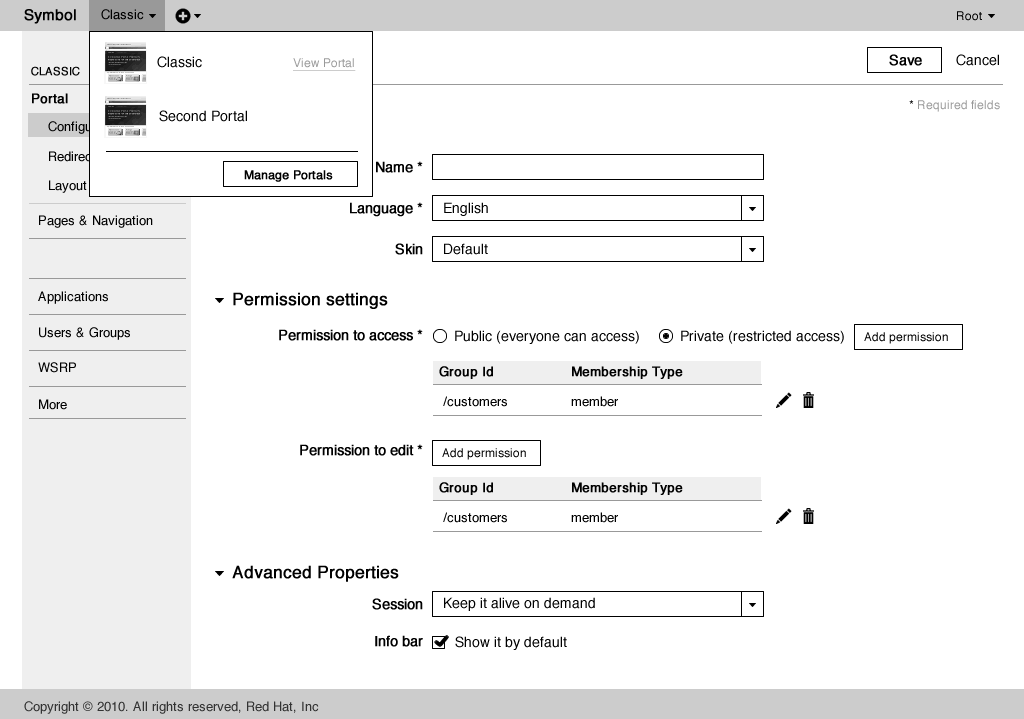
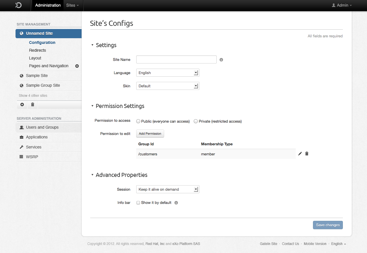
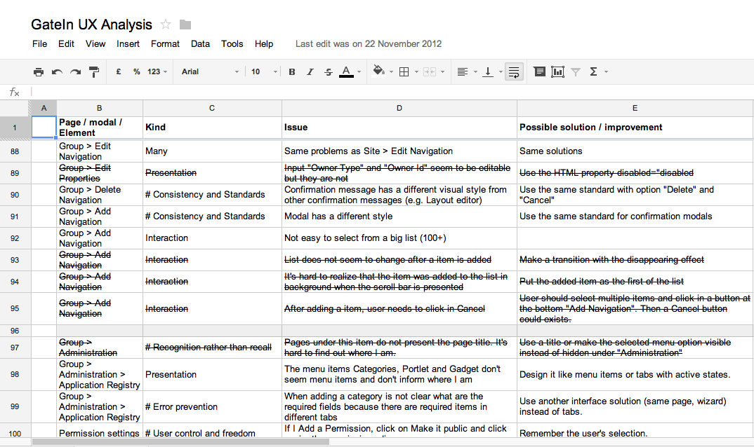
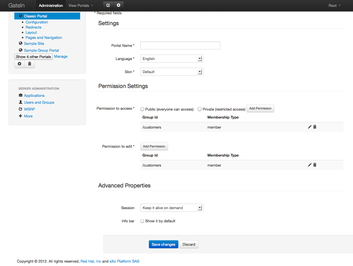
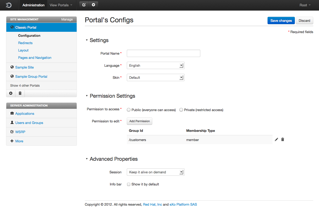
About the temporal aspects, Roto and colleagues [10] presents a more complete model that covers the relation with the product even before usage (e.g. advertisement) and adds the idea of a cumulative user experience (related to the user’s idea about a multiple periods of use). This separation is very powerful in terms of design and evaluation. The before usage phase is related to the user's mental model about the product based on what he has read or heard about it. By evaluating this, it's possible to understand what the audience is thinking and change the speech if necessary.The during usage phase is related to the visceral reaction of the first impression (milliseconds) -- when is possible to see if the visual design is pleasant or not -- and to the first interaction -- when is possible to evaluate how intuitive is the design. After an interaction episode, the user has an idea about how was the interaction, what allows to evaluate if the experience was positive or negative (the first or following ones). Finally, the over time phase is when the user has already used the product during a reasonable period. An evaluation at this phase allow us to understand his behavior, needs, motivations and frustrations. That's what we are trying to do on the admin UI redesign, where we discussed some ideas [11] and will interview actual customers to understand better what they really need -- what allow us to take the design to a higher level.


In my opinion, the understanding of the concept of user experience is essential for designers and developers to be able to work on digital products that aim to deliver meaningful experiences to their users. It is important to understand that user experience goes beyond usability and shifts the attention from the product perspective to an user perspective, where the project is guided by the understanding of who are the users and by user-centered evaluations, in an iterative process of understanding, designing and evaluating to refine until it's good enough.


To conclude, it’s not possible to design the user experience. Garrett's process and the related disciplines only contributes to the design process. Thus, it's only possible to design for the user experience. User experience is not about the product, its aesthetics or how fancy the interfaces are. It's about delivering a valuable experience with technology. And to achieve this, you need to stand out from the computer and talk to people.


References


[1] HASSENZAHL, Marc; TRACKTINSKY, Noam. User experience – a research agenda. Behaviour and Information Technology, London, v. 25, n. 2, p. 91-97, 2006. Available at: <http://www.informaworld.com/openurl?genre=article&doi=10.1080/01449290500330331&magic=crossref>. Accessed 8 October 2011.


[2] NORMAN, Donald; MILLER, Jim; HENDERSON, Austin. What You See, Some of What's in the Future, And How We Go About Doing It. In: Conference on Human Factors in Computing Systems, 13., 1995, Denver. Proceedings… New York: ACM Digital Library, p. 155.


[3] LAW, Effie et al. Understanding, Scoping and Defining User Experience: A Survey Approach. In: Conference on Human Factors in Computing Systems, 27., 2009, Boston. Proceedings... New York: ACM Digital Library, 2009, p. 719-728.


[4] MERHOLTZ, Peter. Peter in Conversation with Don Norman About UX & Innovation. 2007. Available at: <http://www.adaptivepath.com/ideas/e000862>. Accessed 3 November 2011.


[5] PREECE, Jennifer; ROGERS, Yvonne; SHARP, Helen. Interaction Design: Beyond human-computer interaction. 2nd ed. West Sussex: John Wiley & Sons, 2002.


[6] HASSENZAHL, Marc. User Experience (UX): Towards an experiential perspective on product quality. 2008. Available at: <http://www.marc-hassenzahl.de/pdfs/hassenzahl-ihm08.pdf>. Accessed 10 May 2011.


[7] GARRETT, Jesse J. The Elements of User Experience: User-centered Design for the Web. New York: New Riders, 2002.


[8] COOPER, Alan; REIMAN, Robert; CRONIN, David. About Face 3: The Essentials of Interaction Design. Indianapolis: Wiley Publishing, 2007.


[9] GARRETT, Jesse J. The Elements of User Experience: User-centered Design for the Web and Beyond. New York: New Riders, 2011.


[10] ROTO, Virpi; KETOLA, Pekka; HUOTARI, Susan. User Experience Evaluation in Nokia. Now Let's Do It in Practice In: User Experience Evaluation Methods in Product Development workshop in CHI'08. Florence, Italy, 2008.


[11] Administration UI. Thread at GateIn Forum. Available at: https://community.jboss.org/thread/198872

Filter Blog

By date:
By tag: