This document is a first draft for some user interface studies for GateIn.
What do we want to communicate with the interface?
The main goal of the interface is to be the media between the user and the computer or software. On top of this, we can make it in a way that communicates some concepts to our customers in terms of brand. Here are some that I consider the core:
• GateIn is robust
• GateIn is reliable (professional)
• GateIn is innovative
• GateIn is intuitive
• GateIn is concerned with providing a good User Experience
We can communicate these concepts in terms of colors, forms and the way the interactions happen.
Color palette
According the book La Armonía de los Colores (The Harmony of Colors), colors have meaning. So it's important to use colors that communicate the concepts we want:
• Grey: the color of technology (innovation) and of the metals, that are resistant. (Robustness)
• Grey/Black: the colors of the professionalism.
• Marine Blue: the color of the confidence. (Reliability)
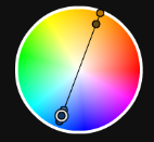
The color palette could seem like this:
Coincidentally, this is the palette used in the current GateIn and also the default color of Twitter Bootstrap, that can be seen in our early HTML for the Admin UI.
Since this combination may seem a bit boring some cases, so some vibrant color can bring some energy. A color that works well with marine blue is orange, its complementary color. The combination blue-orange calls much attention.
Also, orange means dynamics, creativity and good quality, some values related to GateIn as well.
Layout
To communicate some intuitiveness, we can make use of the layout. Thus, the redesign is based on the following principles:
• To have a clean interface (with considerable spacing, big fonts, not much decoration)
• To use strong hierarchies (user should be able to recognize what is more important first)
• To show one primary action per screen
• To show a pleasant organization.
Interaction
To provide a good user experience, first we need to eliminate the usability problems. But that's not enough. User experience is about feelings and sensations. So we need to put some components that makes our users happier, like:
• A very pleasant interface
• Direct manipulation
• Animated transitions
• Magical interactions (more than what they're expecting)
Real examples
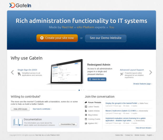
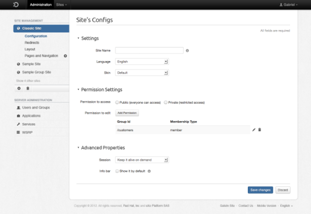
We currently have two pages redesigned based on these principles. Check them out:
On top of the visual design, you can find more information about the page goals on:
-


Comments