This content has been marked as final.
Show 6 replies
-
1. Re: Administration UI: Mobile Redirection
mwringe Aug 27, 2012 4:33 PM (in response to gcardoso)
The mobile redirect has a very complex configuration. Its going to be tough to get a nice clean and simple UI design for it. I think what you currently have is going in the right direction. I have a couple of comments listed below:
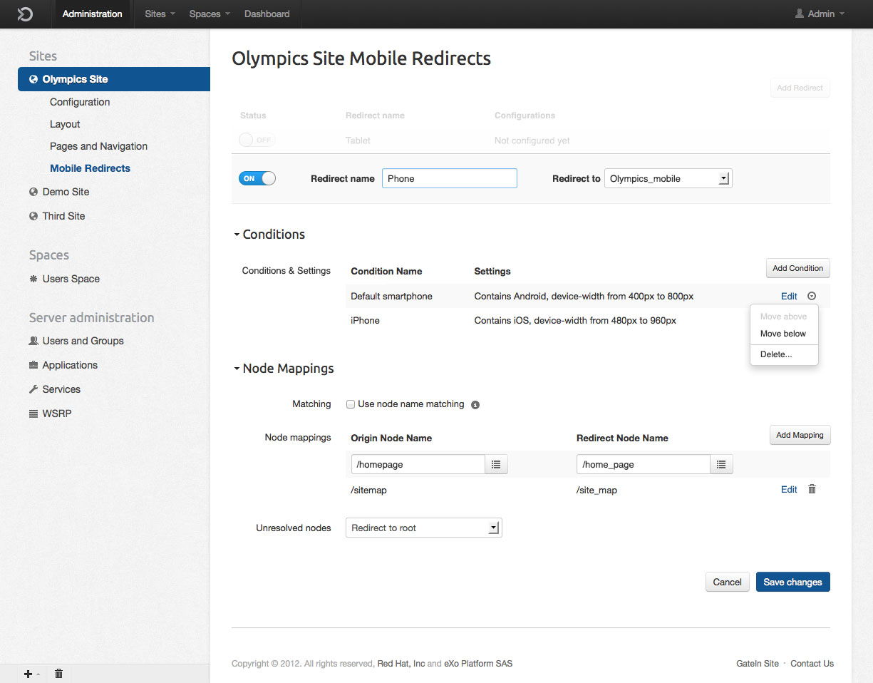
mobile01.jpg
- clicking on/off should probably not load the configuration page, there is a configuration button for this and an admin may want to configure the redirect before enabling it.
- I don't know if I like the expansion of the redirect when you click configure, I think a separate page would be cleaner (but this is a design issue, my opinion may be wrong).
mobile01.jpg
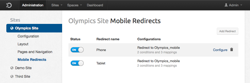
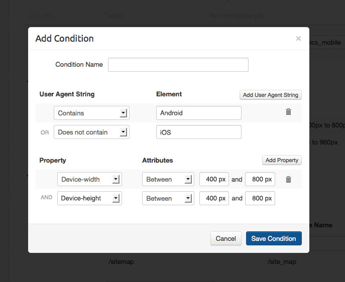
- Would it be possible to use drag-n-drop for the ordering of conditions? and a delete icon? Do we really need the drop down menu?
- Is anything meant to go in the column 'Conditions & Settings'? Would it be possible to delete this column if its not needed?
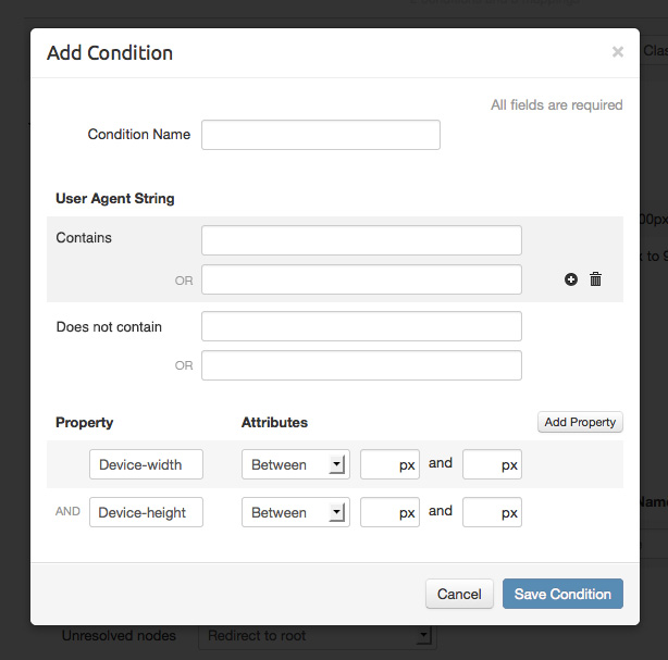
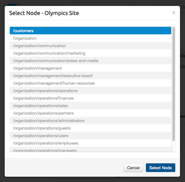
mobile03.jpg
- the propertiy names are admin configurable and there is no way to pre-determine there values. A text input box is probably the only option we can use for this.
- the User Agent String part needs to be two separate sections. Something like this may work:
User Agent String
Contains:
[==============]
or [==============]
or [==============]
Does Not Contain:
[==============]
or [==============]
or [==============]
Since this is such a complex configuration, any input you have on how to simplify the underlying configuration would also be appreciated.
-
2. Re: Administration UI: Mobile Redirection
gcardoso Aug 29, 2012 12:18 PM (in response to mwringe)
Matt, thanks for your comments.
- clicking on/off should probably not load the configuration page, there is a configuration button for this and an admin may want to configure the redirect before enabling it.
I agree that he may want to configure the redirect before enabling it and he can do so. But what would happen if he tried to turn it on before configuring it? Instead of showing a feedback like "you need to configure it first", we present the configuration page. This only happens with the default redirect, since the next ones must be configured and saved to appear in the list.
- I don't know if I like the expansion of the redirect when you click configure, I think a separate page would be cleaner (but this is a design issue, my opinion may be wrong).
This was a design decision. I experimented both approaches and this one seemed better since we have plenty of space on the page and it wouldn't require a new page load. It's also more contextual (I can see that I'm really editing the second line and don't need to go back to be sure that I clicked the right element). But we can see if more people complain.
- Would it be possible to use drag-n-drop for the ordering of conditions? and a delete icon? Do we really need the drop down menu?
Here I was thinking about reducing the implementation effort. It is possible to use a drag-n-drop but,will this action be very used?
- Is anything meant to go in the column 'Conditions & Settings'? Would it be possible to delete this column if its not needed?
Actually this is the label, like Matching or Unresolved Nodes below. But you are right, we don't need it since it's the only label inside "Conditions". I updated the proposal:
- the propertiy names are admin configurable and there is no way to pre-determine there values. A text input box is probably the only option we can use for this.
- the User Agent String part needs to be two separate sections. Something like this may work:
What about this new proposal?

-
3. Re: Administration UI: Mobile Redirection
mwringe Aug 29, 2012 1:49 PM (in response to gcardoso)
I agree that he may want to configure the redirect before enabling it and he can do so. But what would happen if he tried to turn it on before configuring it?
I don't know how someone is going to enable a redirect that doesn't exist yet If a redirect exists, it has already been configured. There is no special 'default' configurations, they are just redirects configured through xml instead of the admin ui. It should not be treated any differently
Here I was thinking about reducing the implementation effort. It is possible to use a drag-n-drop but,will this action be very used?
Having drag-n-drop will make the ui much cleaner, since it means we can get rid of the extra buttons to move up/down in the list. It also means if someone wants to switch the top element and the bottom element, its just 2 simple click and drag instead of clicking 'move up' multiple times for the bottom element and 'move down' multiple times for the top element. I think drag-n-drop is the only real option here.
What about this new proposal?
I like it and I think it will work much better.
Thanks
-
4. Re: Administration UI: Mobile Redirection
gcardoso Aug 29, 2012 2:19 PM (in response to mwringe)
I don't know how someone is going to enable a redirect that doesn't exist yet If a redirect exists, it has already been configured. There is no special 'default' configurations, they are just redirects configured through xml instead of the admin ui. It should not be treated any differently
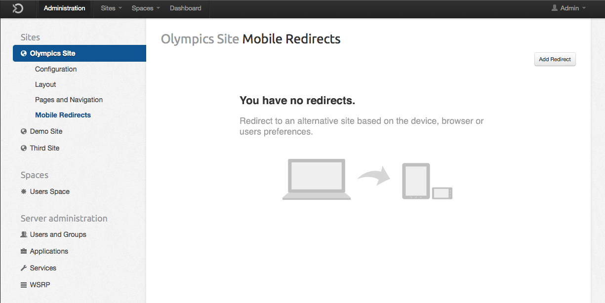
Actually the idea is to show something in the page besides the button "Add redirect". This way the user already sees something and configuring it is has the same effect of adding a redirect. In terms of development, that could be something displayed in the UI and only saved on the xml after configuring and clicking Save. It's an approach for the empty screen. We could present it empty or with some message, but I believe this is useful and aesthetically interesting. I agree that the name "Default redirect" could be better.
Having drag-n-drop will make the ui much cleaner, since it means we can get rid of the extra buttons to move up/down in the list. It also means if someone wants to switch the top element and the bottom element, its just 2 simple click and drag instead of clicking 'move up' multiple times for the bottom element and 'move down' multiple times for the top element. I think drag-n-drop is the only real option here.
You are right, I was neglecting the scenario with many elements. I'll take a look in some drag and drop plugins.
Thanks
-
5. Re: Administration UI: Mobile Redirection
mwringe Aug 29, 2012 2:27 PM (in response to gcardoso)
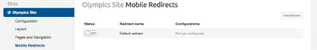
If there are no redirects, just have a message that says so. Having the concept of a always present, not deletable, redirect doesn't make any sense to me.
-
6. Re: Administration UI: Mobile Redirection
gcardoso Aug 30, 2012 3:47 PM (in response to mwringe)
You are right. So I came up with something less boring than a simple message, making a better use of the space. What do you think?

Thanks