All Places > GateIn > Blog > 2013 >
May
2013
JUDCon 2013 Brazil talk: Designing a New User Interface for Open Source Projects
Posted by gcardoso May 3, 2013This year was the first time that JUDCon came to Brazil. The event happened on April 19 and 20, and was the first Red Hat Latin American Developer Conference. Mark Little, who leads the JBoss engineering team gave a keynote and announced the rebranding of JBoss As as WildFly.
The JUDCon 2013:Brazil presented nearly 70 sessions and had an attendance to 340 developers. Since talks about design are rare in this kind of event, I decided to submit mine, which was approved: Designing a New User Interface for Open Source Projects. In this post you can follow a little of what was covered in the presentation.
A project without a designer
I started saying that the User Interface of an Open Source project can suffer a lot without a designer. And that's not only related to visual design, but also to usability, the quality of usage.
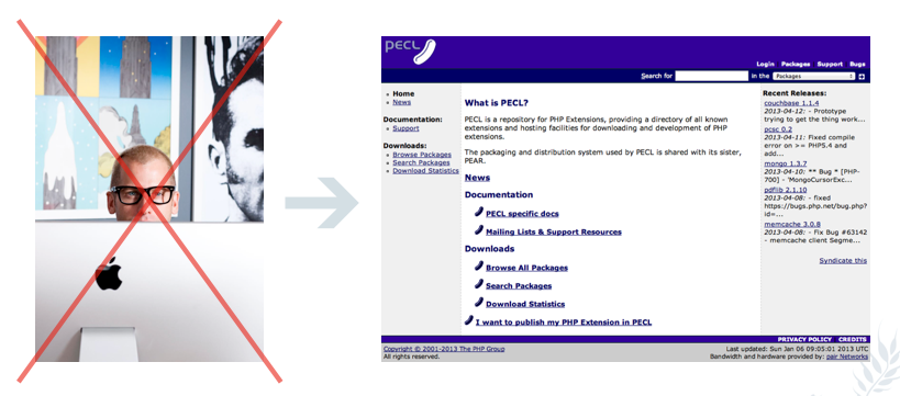
As an example, I shown the page of PECL, a repository for PHP Extensions. I guess they probably don't have a designer in the team... What do you think?
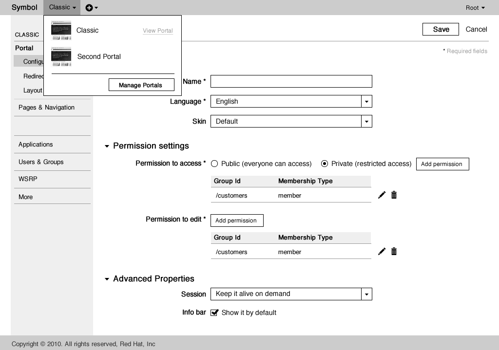
In the case of Gatein, some inconsistencies have been appearing over time. Do you see any reason for the login pop-up (in the left) and the login page (in the right) to be different?
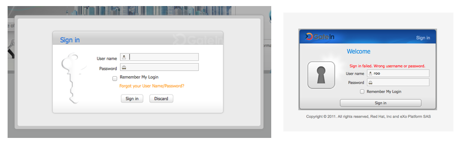
In this example, we can see inconsistencies of visual design (header, left image, colors, borders) and navigation design (the option "forgot user/password" and the possibility of getting out of the dialog is only available in the popup).
But how to avoid that inconsistencies and usability problems happen?
A design process for the Web
Instead of defining everything when you are ready to code the solution, how about following a design process that divides the problem in steps? That's what Jesse James Garrett presented in his famous diagram "The elements of user experience" in the early 2000's.
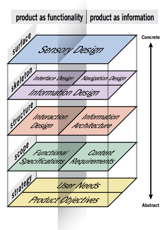
He is basically saying that, after having the scope (requirements), it is needed to think about structure (flows and information architecture maps), skeleton (wireframes) and only after that go to the visual design. The next images show examples of this steps in the redesign of GateIn.
Structure: fragment of the new Information Architecture proposed for GateIn
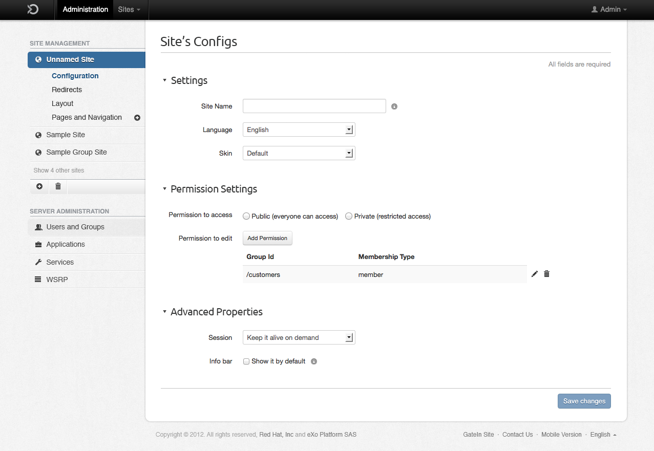
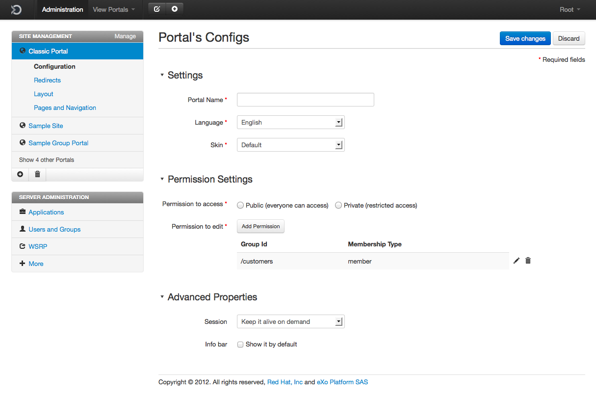
Skeleton: Wireframe for the Portal Configuration page. The new design proposed the usage of more pages instead of pop-up dialogues.
Surface: first proposal of visual design for the redesign of Gatein.
Where to start in case of a redesign?
Ok, that's the process of design. But where to start in case of a redesign? Specifically in GateIn, we wanted to improve visual design and usability. So my first task when I joined the development team was to conduct a usability inspection. To do that, I followed the Jakob Nielsen's 10 Heuristics for User Interface Design.
The outcome of this work was a spreadsheet listing the problems found. Usability inspection: fragment of the list with the usability problems found.
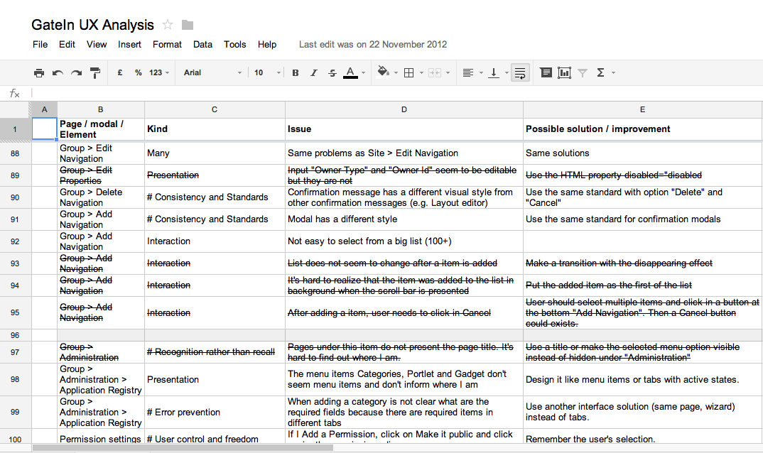
Usability inspection: fragment of the list with the usability problems found.
Based on that, we could prioritize which pages to redesign first. The first one was the Portal Configuration page. After proposing a new Information Architecture for the portal and a new wireframe for the page, we went to the implementation of it in HTML and CSS.
Speeding up with Twitter Bootstrap
To accelerate the implementation, we decided to test Twitter Bootstrap, a front-end framework to speed up the development. The first implementation was done based on the wireframe, without having the visual design. We used only the HTML structure suggested by Bootstrap, without adding any line of CSS. The result can be seen in the next image.
Our HTML with only CSS from Twitter Bootstrap.
Without any customized CSS, Twitter Bootstrap already provides a good header, nice buttons, a solid structure for the sidebar and well-designed forms, including tables. By adding a customized CSS with only 250 lines, we could achieve the result of the next image.
It is interesting to say that, without Twitter Bootstrap, this design would need much more lines and time to be implemented. It needed only around 15 hours to look like this.
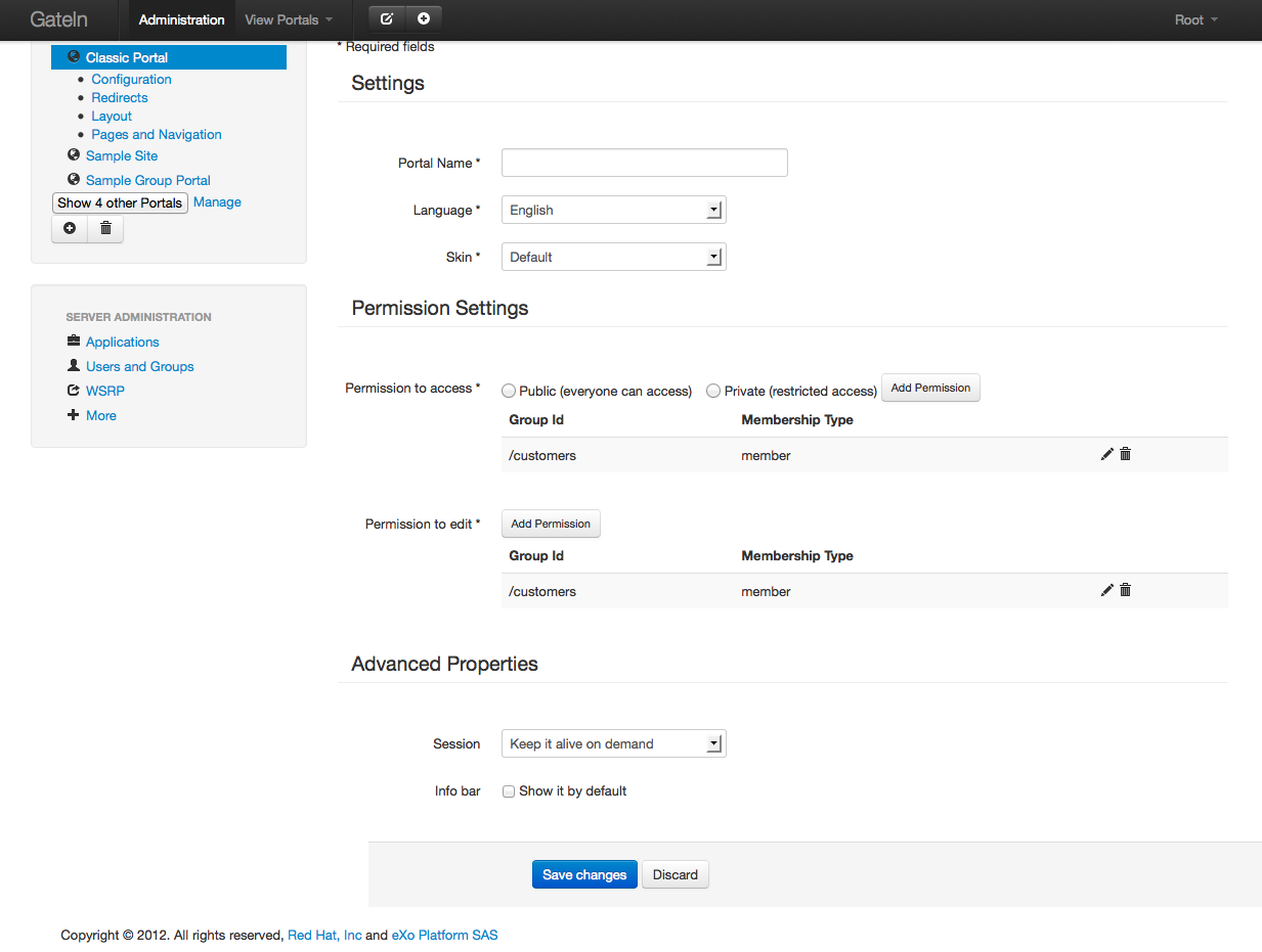
Although the interface was OK, we wanted something more special for GateIn. Based on this HTML prototype, we refined the visual design and reached the following result:
The redesigned pages were also implemented in HTML + CSS + jQuery, and can be seen at:
- https://statichtml-theute.rhcloud.com/cardosogabriel/gatein-client/site-config.html
- https://statichtml-theute.rhcloud.com/cardosogabriel/gatein-client/site-redirects.html
- https://statichtml-theute.rhcloud.com/cardosogabriel/gatein-client/space-config.html
- https://statichtml-theute.rhcloud.com/cardosogabriel/gatein-client/index.html
A mobile demo with Responsive Web Design
Since we planned on launching site redirects support for GateIn 3.6, we decided to offer a mobile demo with a design that works well in mobile devices.
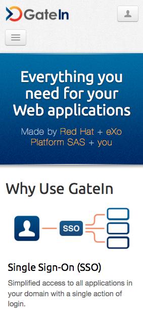
Mobile demo in a smaller screen.
Before being integrated to the project, it was implemented in HTML + CSS + jQuery, using Twitter Bootstrap too. The solution can be seen here: http://statichtml-theute.rhcloud.com/cardosogabriel/gatein-client/responsive/index-mobile.html. Try to reduce and increase the size of the window, or access it in different devices.
To make the original design responsive, I focused on two details:
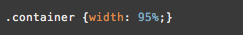
Fluid widths and distances in percentage (%)
If you want to make the design fit the screen, you need to convert the widths, margins and paddings to "%" instead of "px". Here is an example:
This makes the container (width of the page) fit 95% of the width of the device, instead of having a fixed width that would not fit all devices.
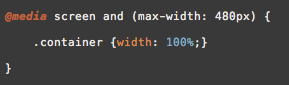
Break points
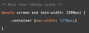
This is the magic of the Responsive Web Design. With break points you can declare specific CSS for specific dimensions. In the case of the Mobile Demo, I wanted the container to fit 95% of the screen for most of the cases. However, for smaller widths, I wanted it to occupy 100%, and for bigger widths, I wanted it to occupy 1170px as maximum. To do that, you just need to do declarations like these:
Conclusion
With this talk I wanted to show the design process that comes from the requirements until the HTML implementation. The full presentation can be seen at: http://www.slideshare.net/gabrielcardoso9/designing-a-new-user-interface-for-open-source-projects
GateIn was an excellent showcase, since its redesign followed the steps presented by Garrett in its diagram. Twitter Bootstrap provided nice UI components reduced significantly the time required to implement the solutions. Having applied the Responsive Web Design to the interface was exciting and made it look beautiful in many different devices.
I hope you have learnt something from this post. Stay tuned to the next GateIn releases. More design news are coming