-
15. Re: Administration UI
gcardoso Apr 30, 2012 10:06 AM (in response to julien_viet)Good to know that I was clearer now.
You are right, the current work is proposal for the Admin taking in account only the current features with the current permission settings. However, aside the concept of a centralized admin, I worked on some usability problems. Please ignore 2, now I understand that we want to change it a lot.
I agree that RedHat and eXo should discuss this together . To avoid losing the work I did, I'm attaching some other screens. So we can come back to them in the future.
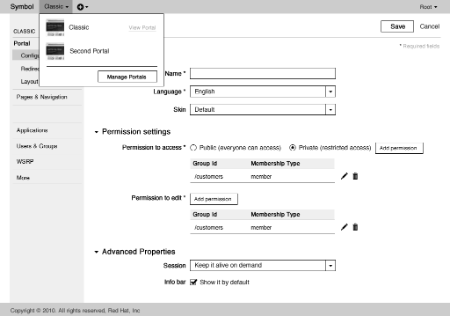
1) Initial admin's screen after login.
2) Portal management, following Stévan's advice to not allow users to delete the portal from the dropdown.
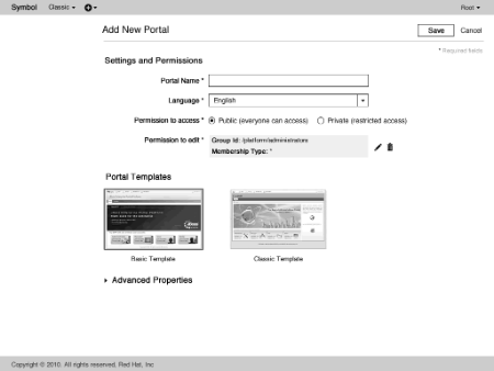
3) Page to Add a Portal (instead of a pop up). Better to recognize the required files and to avoid errors. Advanced options (session / info bar) come predefined and minimized. After creating a Portal, the user is redirected to screen 1.
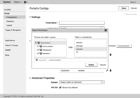
4) Pop up Edit Permissions. I maked more clear that user needs to select a group then a membership. He also needs to click Select to finish the operation (user control and error prevention).
I hope the work has not been useless and wait for an opportunity to discuss this with you and Stévan out of the Forum.
Thanks
-
16. Re: Administration UI
theute May 2, 2012 2:22 AM (in response to gcardoso)It's all contributors and users that are concerned by such changes, the discussion is happening and need to happen here (not out of the forum)
-
17. Re: Administration UI
julien_viet May 2, 2012 5:48 AM (in response to theute)I haven't said discussion should not happen here : This thread is about how it will look like and how it will be interacted with.
I suggested that both parties meet (under some undertemined form) to discuss higher level view of things, here is an example : "eXo wants to have content available in composer and mini composer", this is part of the product roadmap, this will influence the admin UI (portal or centralized). Here is another example "RHT is adding a feature for mobile, those features will be configurable from the centralized admin".
Without those side discusssions, I'm affraid this thread will not give the best outcome.
-
18. Re: Administration UI
claprun May 3, 2012 10:46 AM (in response to stevan_lemeur)Hi Stévan, I agree with many of your points, however, I disagree with putting the buttons on the right side. Putting them on the right side make them less obvious but, more importantly, it also make them move around depending on the width of the browser window (unless we fix the width of the UI, of course). If we put them close to the left column, then we can assume that they will always be at the same spot, building muscle memory, instead of moving around.
-
19. Re: Administration UI
claprun May 3, 2012 11:29 AM (in response to gcardoso)My biggest issue with the current proposal is that it mixes levels of informations. Some parts of the UI are modal while other are not and it's not obvious to the user which is which. More precisely, I think the left menu should be more tree-structured than it currently is and the portal dropdown should be removed: all portals should be listed on the left at the same level and each portal node could be expanded to reveal the sub sections. Breadcrumbs at the top of the main panel would reinforce this context as well. This way things would be more consistent as this also allows for sections to have subsections (as would be needed for WSRP, for example).
So the left menu would look something as follows:
- Portals
- Classic
- Redirects
- Layout
- Pages & Navigation
- Second Portal
- Classic
- Applications
- Users & Groups
- WSRP
- Consumers
- selfv1
- selfv2
- Producer
- Consumers
- ...
In that case, clicking on the portal name would display the configuration screen as in 1), clicking on Portals would show 2).
I also believe that adding a portal should show the configuration screen directly instead of having an intermediate screen that basically duplicates the functionality for no real good reason.
- Portals
-
20. Re: Administration UI
gcardoso May 3, 2012 2:38 PM (in response to claprun)Good points, Chris.
I believe it is not necessary to be obvious to the user which link is a page or which is a modal. That happens all the time in many sites and apps and it's OK. My point is to use modals properly (when is better for the user to keep on the current page). So if we replace some modals by pages would be good to the UX.
Are this "more tree-structured menu" something like Windows explorer? The approach of the portals listed on the left would only be appropriate if the admin wants to manage multiple pages of multiple portals at a time. It would be useful if he wanted to configure one page of one portal (e.g. Redirects of Classic) then another our the same page of other portal (e.g. Portal's Configs or Redirects of Second Portal). Then he would gain speed with the tree navigation. I am not sure if that is the most common case. If not, the concept of managing an unique Portal per time is better, so we don't need to add complexity to the left sidebar by putting more links and trees.
In my point of view your solution would bring complexity to the navigation and informational load with three levels. So if managing multiple pages of multiple portals are an exception I would stay with some proposal that keep the option to manage one portal per time.
About the page "Add Portal", it cannot be the same as Portal's Configs because of context. The Admin should not see the sidebar during the page creation (to focus on the task). They are also different because is necessary to choose the template during the creation.
-
21. Re: Administration UI
claprun May 3, 2012 4:13 PM (in response to gcardoso)There would only ever one portal "node" expanded at any given time, and only when a portal is being looked at. Same for the other nodes (for example, for WSRP, the consumers would only be shown if the user clicked on Consumers). For that matter, the portals list or the WSRP subsections or the subsections of any section would only be displayed if a user selected it to expand it.
Also, the main panel wouldn't change from what you're proposing: you would only see the details of one portal or one consumer, it wouldn't be possible to see several portals at once so I don't quite understand your comment on managing "multiple pages of multiple portals". The left menu would be single-selection only, the main panel only showing the details of what is being selected.
I also don't agree that my solution would make things more complex since I think the behavior of the selection would be consistent for all elements in the menu. In your proposal, you sometimes have to select from the dropdown, sometimes from the left menu… Also, the levels of information are different and your solution doesn't reflect very well the fact that some left menu items only apply to a given portal while other are portal-independent. Showing hierarchy using a tree-like menu reinforces the contextual nature of information for users thus making the associated mental model more visible.
Finally, for me, anything that can be configured on the Add portal page should also be configurable on already created portals so I don't see why we would need a different page for it. Having similar pages for somewhat related tasks would only confuse users, in my opinion. It would also be a maintenance burden on developers but that's a secondary consideration for the moment.
-
22. Re: Administration UI
stevan_lemeur May 3, 2012 5:54 PM (in response to claprun)Hi Chris,
Your first point is about "Save/Close" buttons, putting them on the right is simply a choice. And probably it depends more on if you are familiar with a Mac or a Microsoft environment. I hope, the consideration of putting them on the right or on the left will have no impacts on GateIn performances... But here, my most important concern is to make the choice consistent everywhere in our products.
About the sidebar, and the "tree-navigation model", I think here there is a something that must be clearer for users :
- Settings/Configuration relative to one portal
- Settings relative to all portals
I'm agree with you, the mix of them in current mockup is quite complex to understand for users.
Correct me if I'm wrong, but the idea you explained is more using "accordeon list" instead of "tree-navigation model" ? where one "node" is expandable at a time ?
In that case, I think we should take care about having subsections also working on this way. Simply because it will create three depth levels like you mentionned here :
- Portals
- Classic Portal
- Redirects
- Layout
- Pages & Navigation
- Second Portal
- Classic Portal
- Applications
- Users & Groups
- WSRP
- Consumers
- selfv1
- selfv2
- Producer
- Consumers
- ...
I would prefer :
- Classic Portal
- Redirects
- Layout
- Pages & Navigation
- Second Portal
- Redirects
- Layout
- Pages & Navigation
- ...
- Applications
- Users & Groups
- WSRP
- Consumers
- Producer
- ...
(of course, with only one subsection expanded at a time)
An other solution can be in the dropdown of Portal selection, we should have :
- All Portals
- Classic Portal
- Second Portal
In this case, links will redirect to dedicated parts of settings.
What do you think ? Hope that helps !
-
23. Re: Administration UI
claprun May 4, 2012 4:54 AM (in response to stevan_lemeur)For the Save/Cancel button, there is value in always having them at the same spot. Like I said, I believe having them on the left make them stationary with respect to window width thus allowing users to build muscle memory. However, as you point out, there is also value in having buttons located in the same spot across apps. I would argue, though, that since we are working on improving the UI for GateIn, we should focus on improving it regardless of what exists in other applications and focus on making it the best user experience we can. The decisions we make for GateIn should then trickle down to other products built on top of it. This is more work but this is also the right way to do it, in my opinion. Plus, I would think that upstream apps would want to match the visual style provided in the core portal.
I would also argue that the button labels should be more explicit than just Save/Cancel and reflect the exact action that will happen when it's not as clear cut what will happen when pressing a button.
Finally, I don't see what the big issue is with having 3 levels. Users will only see the level they are interested in if there's only one section expanded at a time. Also, in your proposed solution, you would need a special case to handle operations that apply to portals (such as adding / removing a portal), which is nicely handled (with the hierarchical model visual indication) in my solution. The point of showing all portals in the left menu is to remove the awkward need to have a dropdown to select portals and use a single UI element to accomplish all actions using a consistent interaction model. This encourages learnability (a single interaction model is more easily acquired (and documented!) than having different modes of interaction) and helps with discoverability since users will only need to worry about one menu on the left and the main panel for all their administrative tasks (instead of having to sometimes go to the top bar, sometimes to the left one). I believe that the top bar should used as little as possible and only for tasks that are unrelated to administrative tasks (in the context of the admin GUI, of course). For that matter, I also believe that go to the default portal, change skin, change language and login/logout should be the only available operations in the top bar. Everything else should be solely focused on administrative tasks and should be chosen from the left bar.
-
24. Re: Administration UI
stevan_lemeur May 4, 2012 9:47 AM (in response to claprun)I would like to synthesize a little what we said.
About the sidebar on the left. I think we can use only this bar as a way to navigate through different administration portlets. So my first concern is about actions in the topbar, that I finally feel them unnecessary with a sidebar like the concept explained by Chris. The reason is that it's easier to have all navigation elements on the left sidebar, to let the server administrator be able to clearly identify where are all entry points.
My second concern is about the contextual selection of a site to be able to add a page in it. I think we should not display this feature as a key one from this "Administration Part" as adding a new page is probably a feature more oriented to "content publishers" and not "administrator of a server". It should still be able, but not from the top bar.
That's why I think we can remove all stuff from the topbar.
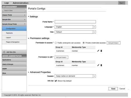
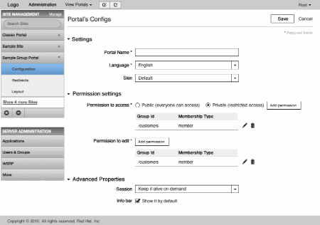
Finally, here is the result of my proposal :
There is headers to separate "Site Management" and "Server Management" parts.
To manage the case where a server is managing a lot of sites, an user can scroll into the "Site Management" part or use the search, to directly filters all sites.
I put a small indicator, to let the user know which Site is "expanded" and which ones are "collapse"... It must follow behaviors of an "accordeon".
Tell me if it fits with what you've got in mind.
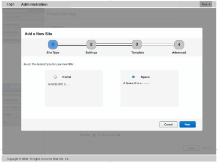
The second point, is about making the creation of a new Site easier. For that, the idea is to provide a wizard to drive the administrator into various step of a Site Creation. This gives us the opportunity to describe the concepts that are ours (like what is a Portal, what is a Space ?), but that must be understood by an administrator.
Like this sample :
-
25. Re: Administration UI
claprun May 4, 2012 2:00 PM (in response to stevan_lemeur)Seems good to me. I still think there is value in having a screen showing all the portals, especially if there are many of them. Good catch on the search/filtering box, by the way. We will probably need to have some internal scrolling pane for the portal names if there are many of them in the Site management section. Something like the iOS scroll bar with the alphabet being overlaid for rapid & rather precise scrolling would be quite nice to implement (albeit, I'm not sure how easy it would be to develop such a component with only web techs). Further refinement could include only highlighting/showing letters that actually have portals associated with them.
I also don't think there is an issue with having more than two levels on the left side (and probably what I will end up doing for WSRP).
One thing that is missing, though, is that we need a delete button somewhere for portal or pages or anything that can be deleted. We could have a delete icon appearing when you hover over a portal name but that might be tricky to implement right (what if the portal name is long, the hit target shouldn't be too small but it also shouldn't be too big so that people don't click on it by mistake, etc) and is kind of bad for discovery.
Otherwise, +1 on the wizard part of things, unless there aren't that many details that *need* to be decided when a portal is created. Wizard should only be used when there are rather different options to be chosen and when all the steps are necessary and make sense. Nothing is more annoying than a wizard that asks you lots of questions you don't really care about. So the information level to be presented there needs to be properly thought out.
Finally, I don't think we would have a More button, new modules would just be added there. Possibly, we could let users decide which administration modules they would like to see. Similarly, maybe we could also allow them to temporarily add some portals they're not interested in but I'm getting into a too low level of details so I'd better stop…
-
26. Re: Administration UI
gcardoso May 4, 2012 4:20 PM (in response to claprun)Nice collaboration Chris / Stévan. I think we have a proposal that follow Chris' idea and avoid three levels of navigation at the sidebar
I noticed that with the redesign some functionality is missing, like the possibility to view a Portal, edit the current page and quickly add a page. So I suggest some changes at the top bar (see below) to make it consistent when the Admin/Publisher are both in the Admin area and in the Site. In the admin area he would see Administration (as the active link), View Portals (with the list of portals in the drop down) and the buttons Edit Page + Add Page. In the Site, he would see a link to Administration, "Classic Portal" (with a drop down to go to another portal) and also the buttons Edit Page + Add Page (the detail is that the addition here does not need to ask for which portal).
The headings at the sidebar worked well! According Chris' suggestion to keep a page to see all the portals, I suggest a link like "Manage" or "More" near to "Site Management".
I'm not sure if we need a Site Search. That would be probably useful for more than 7 sites. So maybe we could show the Search field only when the user has many sites. Otherwise is useless and a noise in the interface.
A bad point is that if we have many sites the sidebar starts to be too crowded. We could avoid the scroll at the sidebar (which is not good since we already have a page scroll) and present initially the last three modified sites with a button show more that expands the list. This would reduce the noise at first without removing user's control. Obviously this link only appears in case of more than 3 Portals.
For the actions to add and remove a portal, I propose two buttons more integrated to the box "Site Management". When no site is selected the button delete appears disabled.
I also tried to isolate more the different groups. So that's my proposal for these topics:
I like the idea of the wizard. This makes sense with the site type choose (which I have not noticed before).
I agree with Stevan's idea to keep only two levels at the sidebar. If we need a third level, we can use the page's area and work with some tabs or another solution.
-
27. Re: Administration UI
claprun May 7, 2012 5:54 AM (in response to gcardoso)I think the top bar should be as empty as possible to limit the distractions. I don't think that the admin portal should be treated just as any other portal that you can edit… It's still my opinion that everything should be doable from the left bar and not dilute the attention across several UI elements.
Overall, I'm concerned that with the insistence on keeping hierarchy levels to only 2 on the left side, we're starting to make the UI more and more complex for not real good reason (i.e. why is having 3 levels so much worse than just 2), when it would allow us to reinforce the context aspects of the navigation and allow a more natural to add screens to manage groups of elements (which, in the current design, is very contrived). Instead of making management of all elements such as portals or WSRP consumers second-class elements, it would give them their rightful place and also allow us to properly host add and remove operations without having to resort to artificial manipulations such as hiding / showing elements based on context.
Also, while we should think of a way to handle lots of portals, we should optimize the UI for the simple cases where there won't be that many portals to deal with.
-
28. Re: Administration UI
gcardoso May 9, 2012 4:48 PM (in response to claprun)I don't think the top bar is distractive the way it is right now (did you see the HTML?). It offers the global navigation (admin or view portals) and only a discrete shortcut to add a page (that will remain in the portal page). That's good for consistency between the areas.
Ken also thinks that the Admin Pages should not be editable. So seems to make sense to remove that button.
I don't see Stévan's proposal as more complex than yours. Actually we are offering the list of Portals at first without the necessity of clicking "Portals". I see this as a good strategy since the admin will manage Portals and Server Administration, so why to make him click once more? Also, this proposal reinforce the context of the navigation even more with the headings.
The link to show more Portals tents to be an exception (correct me if I'm wrong) so the UI is optimized for simple cases (one or two portals) since they are displayed at first. That is my vision so I propose that we test the proposal with some users. This will make clear if it is easy to use or not and stop with the battle of guesses.
-
29. Re: Administration UI
antoine_h May 29, 2012 10:33 AM (in response to gcardoso)Hello,
Interesting things.
here some suggestions, related to some point of view (Julien's role mixing warning, etc...)
**********
For the roles : what about the role of "designer and prototype building role" ?
On all (100%) projects I have been working on, the way to use the UI is for design and prototyping, but never for admnistration.
Or at least; the UI is used for looking at things done with the xml/war config (during dev).
When the UI is used for prototyping... it is usefull to go work with the marketing and communication departement, and the business teams involved in the portal.
The portal UI is then a good tool to build quickly the pages, and show thing to these people.
It allow to modify things even during the workshop, "on the fly" with the people around the screen.
The design and the prototyping of the portal is done with "near to real" pages.
This is very convenient and nice for designing the portal.
Then, when this is quite settled, the building of the portal is done by the dev, with the xlm and J2EE War artifacts, following the specifications.
The specifications rely heavily on the prototype.
So, as far as I use and help companies use the portal, this role is important.
It is even less than the "Tech Admin" role, as the prototype does not care about management of the caches etc...
**********
Product definition.
Behind the UI reshape, it looks like there is a need to settle the product vision and definition.
It would be interesting, IMO, to define more clearly the use of the product : for the administrator, for the content and publication manager, for the developer and for the prod administrator.
Then to define the "types of portals, types of uses" of the product.
And at last, for each role, which "facet" (or set of features) of the product is used.
"types of portals, types of uses" of the product :
Are the GateIn/Exo/EPP products made for building quickly some web site ?
Are they platforms for quite heavy web portals, with strong and reliable development cycle (based on J2EE) ?
those two are very different needs, ... with different types of organisation/users that adopt the product.
IMO, for "building quickly some web site", why take some J2EE portal, with the RedHat (or Exo) heavy plateform... when there are so many lightweight and more fitted tools/CMS/small frameworks (with php, ruby, scala, etc...) ?
**********
Trying to have a product that do everything is the best way to provide a product that does not fit any user need.
Prototyping, WCM and content management, Tech Administration of heavy plateforme might need different product, specialized to provide the proper tool for each role/needs.
The packaging of the webapps, with yet separation of the admin, the portal core, etc... would allow to build quite easily those products :
- "Easy Web Site" product, for building quickly some web sites
- "Design and prototyping" product (related to JBoss Tools ?), for big projects
- "Portal platform" product, for big projects, with heavy administration feature
Those are only some samples...
IMO, it is worth thinking this over, with the UI reshaped...
Antoine
Consultant JBoss Portal and GateIn (JSR-286), JSF, Richfaces, J2EE.
