-
15. Re: Group Navigation (Spaces) in the new Admin UI
claprun Jul 14, 2012 1:44 PM (in response to gcardoso)
Not too fan of having to scroll. I think pagination works better as it's more obvious that there is more content and it's a well-known UI pattern.
-
16. Re: Group Navigation (Spaces) in the new Admin UI
gcardoso Jul 16, 2012 4:26 PM (in response to bdaw)
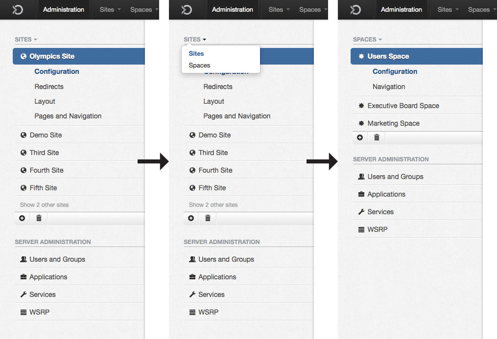
I see two solutions for splitting sites/spaces but they depend on our strategy. The first one assumes that sites will be more used and displays them at first. To see spaces, the user needs to click "Sites" and select "Spaces" from a drop down. To deliver a great UX, it would be desirable for the system to know in which page I am in the Sites area and in the Spaces area to send me to that page when I change from Sites to Spaces (instead of sending me to the first page of each area).
This solution works better when I stay for a long time in one area (not switching between them often). If we want to encourage users to use Spaces, we should inform them about how to go to the Spaces area in the first access.
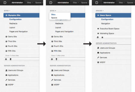
The second solution works better when they switch often between sites/spaces. All the headers can be collapsed/expanded. Since the sidebar can grow a lot here, I propose that the sidebar / content area fit 100% of the height with independent scroll bars. In order to avoid visual noise, the sidebar of the scroll area could be displayed only when the mouse is over the area. The actions to add and delete a site/space are fixed in a bottom bar.
This solution also allows some drag and drop actions (like moving a page from a space to a site by dragging to the sidebar or vice-versa).
What do you think?
-
17. Re: Group Navigation (Spaces) in the new Admin UI
gcardoso Jul 16, 2012 4:54 PM (in response to claprun)
Why the scroll doesn't fit well in this case? I see some benefits: better performance (faster to scroll than paginating), requires a lower motor load (always hard to click the exact pagination button), less polluted interface and a more modern interactive behavior.
Not sure if pagination is more obvious than the scroll and the end of the box finishing in the middle of the words (call to action pattern). And it's probably a well-know pattern because is very old, but I understand that we want to modernize the interface and offer a better user experience
-
18. Re: Group Navigation (Spaces) in the new Admin UI
claprun Jul 17, 2012 6:07 AM (in response to gcardoso)
For me scrolling is slower and less precise if you have lots of elements: you might need to scroll past several screens and in the process scroll so fast after a while that you might miss what you were looking for and have to go back. Also, the scanning area (i.e. the area you are looking at for your search target) is constantly moving and doesn't always contain the same amount of data and, in my mind, that increases cognitive load. I personally find a nice pagination easier to look at since you always have the same amount of data to scan, you never see the same data twice or risk missing some (which would happen if you scroll too slow or too fast). If properly designed, it can look just as modern. Scrolling through a page looks very cluttered to me since some elements might be partly off screen, it doesn't look as nice (but that's a matter of personal preference). If properly designed, with access keys, I believe that it can be a lot faster and precise than scrolling to hit the next page. You can also go to the end of the list much faster than with scrolling. It's also not obvious, with the scrolling interface, that there might be more elements to load unless you take steps in the interface to show users they can load more elements by scrolling, which clutters the interface. Usability-wise, I really think that pagination is better for longer list of elements. Scrolling might be better for shorter lists but I still believe that it wouldn't look as nice (again, matter of personal preference).
Now, on the engineering front, pagination is also much easier to implement since you can only load one page at a time and, while you can do lazy loading with scrolling, it's trickier to implement it efficiently since users are not as constrained on their navigation so you might end up having to load lots of useless pages which might lead to increased server load and bad perceived user performance as it's possible that the scrolling would pause to load new pages. Of course, it's possible to implement scrolling properly for users but I believe that would come at the expense of server performance, while pagination would allow good user experience (especially coupled with a good search mechanism) with minimal server performance impact.
Finally, as far as modernizing the interface goes, just because something is old doesn't mean we shouldn't use it if it works. I don't agree that scrolling is a "more modern interactive behavior": it might be when you're looking to load more elements like on a blog but when you're searching for something precise it just doesn't work for me and my impression would be that it feels gadgety for an enterprise product.
In conclusion, there might be a better interface than pagination for this problem but I don't believe, based solely on the arguments you present, that scrolling is it.
-
19. Re: Group Navigation (Spaces) in the new Admin UI
claprun Jul 17, 2012 6:10 AM (in response to gcardoso)
I prefer the second solution as it mirrors the navigation bar where we already split sites and spaces and it's less modal (site mode vs. space mode).
-
20. Re: Group Navigation (Spaces) in the new Admin UI
gcardoso Jul 17, 2012 3:15 PM (in response to claprun)
The main reason to use a navigation instead of a continuous scroll is the need for jumping to a specific page. It makes sense when the user knows where the result is, but I don't think that's the case here. There is a cognitive break in the navigation, since the user needs to stop reading the results and find the correct button to see more results. If there's no way to rationally jump to a specific chunk of data, scrolling is easier (you just need to scroll…).
Altough I believe the scroll is better in some cases, if you are sure that it's essential to jump to specific pages and the performance is significantly better, we can use navigation without many problems. The bad thing would be to reload the whole page to browse the navigation, but I believe we can update only the list, don't we?
I only ask you not to condemn the continuous scroll by itself since it can be useful elsewhere.
-
21. Re: Group Navigation (Spaces) in the new Admin UI
claprun Jul 18, 2012 4:22 AM (in response to gcardoso)
I'm not opposed to a scrolling interface in general. I believe it's a great way to browse content when you're not looking for a particular item (for example, a blog or image library). However, I believe that pagination is more appropriate when you know what you're trying to find (which is the case here). If I'm looking for a group which name starts with Z, I don't want to be scrolling through the whole list (and have to load all the data for nothing) before reaching my target. That's the use case we need to focus on: how to quickly reach a random item in a potentially long list. Scrolling would work OK with a small list of items but doesn't scale when the number of elements increases. Think linked list vs indexed list for random access performance!
Maybe instead of pagination based on a fixed number of elements per page, we could have alphabetized pagination where the user could jump to a particular page directly to see all the elements starting with the specified letter (kind of similar to the iOS contact application). We would display a top bar with all the letters, each letter linking to a page containing elements starting with that letter. Letters pointing to empty pages would be grayed out. We could get fancy and couple this with scrolling though it would be quite challenging to implement properly. Another fancy trick would be to change the size of the letters based on the number of associated elements to make it easier to reach more populated pages.
Such alphabetic pagination would be quite modern and efficient, I believe. One problem I see with this interface, though, is the fact that we might end up with heterogenous distributions with some letter "pages" being overly populated and this might require secondary pagination/navigation which would of course be bad… An option would be to split populated letters using a second letter but then you break muscle memory (since the letter list wouldn't be constant anymore), though it might not be that bad since the feature might not be used that often (or at least not often enough to really require muscle memory).
What do you think?
-
22. Re: Group Navigation (Spaces) in the new Admin UI
bdaw Jul 18, 2012 5:37 AM (in response to gcardoso)
For splitting site/space I like the first solution better. I think such design is nice and compact one. Not sure if very frequent switching between both views is the case - I suspect not.
-
23. Re: Group Navigation (Spaces) in the new Admin UI
bdaw Jul 18, 2012 5:47 AM (in response to claprun)
I think scrolling is in fact something that people got used to recently and it is expected modern behaviour. Understanding the need to find precize result search box should be enough imo. What actually would make it most handy is search results showing as you type in the search box.
To be honest I don't see that much value in links to specific page - I always find myself trying to figure out if clicking on 9 will bring me far enough or should I click at 7... Having "alphabetic pages" is some sort of solution but this part would be covered by search box. So in the end the best way is to just to put few beginning letters there to limit results. For fast browsing scroll seems easier as it is same as just clicking next, next, next...
Implementation is another story but on this side we should first check if there are any real blockers before influencing design part
-
24. Re: Group Navigation (Spaces) in the new Admin UI
claprun Jul 18, 2012 6:25 AM (in response to bdaw)
I would say go with scrolling if the main use case was untargeted browsing but I don't believe it is. I think people will know most of the time the item they want and want to get to it as quickly as possible without having to scroll through useless pages until they find what they want.
The issue of going far enough with pagination is a very valid one but it's exactly (if not worse) with scrolling, not to mention the fact that people are used to fast scrolling and implementing fluid scrolling with lead to loading lots of useless data (by pre-loading next "page" and keeping in memory the previous one). It's trickier to get the interaction down well as people expect fast/fluid scrolling while they are used to wait a little when they use a pagination mechanism. Another issue with scrolling is that displaying how much data left is less obvious unless you load all the data to be able to have a to-scale scroll bar or use the same kind of queries that would be needed for a pagination mechanism.
All this for questionable value, in my mind, for the main use case we're trying to address (finding the item we want quickly). I believe the alphabetized pagination is the best compromise since it allows fast browsing when you're not sure which group you want (which I don't think is the main use case but something we still need to support) and quickly accessing a random item (which is the main use case to address, in my opinion). Even in the case of browsing, I believe people still have *some* idea of what they want ("is it 'customers' or 'clients', I can't recall properly…") as opposed to be completely clueless about what they want and just want to look at everything until they find something that works. That last use case is the only one where scrolling would work better. Nothing would be more annoying to users than having to scroll through endless, useless data until they get to what they want, in my mind.
Find-as-you-type search box is, of course, something we need to implement, regardless of the solution we choose for the browsing use case.
-
25. Re: Group Navigation (Spaces) in the new Admin UI
gcardoso Jul 18, 2012 5:10 PM (in response to claprun)
Of the three options, it seems that the continuous scroll and the alphabetic navigation are interesting. So let's think about some scenarios:
1) There are not many groups created. Behavior: To browse by list or hierarchy. No need for alphabetic navigations. Scroll is better than pagination to move forward.
2) There is a bunch of groups (100+) and the user is looking for a specific group. Behavior: To click the letter and browse (scroll) OR to make a search.
3) There is a bunch of groups and the user is not sure about the name of the group. Behavior: To browse the list. Scroll is more comfortable than pagination.
In these contexts, I would not use pagination. I would provide search + continuous scroll. An alphabetic list (index) works well for user who already know the name of the item he is looking for. Some people will prefer to use it and more people would prefer to search. We can offer both solutions, but I think that maybe we don't need the alphabetic list.
To conclude I would propose to start with the search and continuous scrolling instead of adding the alphabetic list, since we are not sure if people will use it and whose benefits can be achieved by the search. This would also make the interface cleaner and save us implementation time. Also believe that is better to start with less than more.
-
26. Re: Group Navigation (Spaces) in the new Admin UI
theute Jul 18, 2012 5:51 PM (in response to claprun)
Chris Laprun wrote:
That's the UI challenge we have: clean what we have without changing what already exists underneath while creating a path for a brighter tomorrow!
Can't agree more
Gabriel Cardoso wrote:
For the second point I believe that the design must follow an strategy. Do we really need to hide the spaces or do we want people to understand the concept and use this feature? I thought it was the second case...
+1 I think spaces are useful (and UXP makes it a first class citizen), it's not clear in GateIn 3.x what a "group site" is really about.
About the groups, I had the same concern as Bolek, that listing them all will not work in many scenarios, it's not uncommon to have hundreds of groups. Also we'll have to set a priority and define 1 or 2 ways for now.
I think that hierarchy and group seach are the best, IMO it's easier to find in a hierarchy as usually it categorize nicely the groups.
Sales
--Europe
----France
----Germany
Engineering
--Europe
----France
----Germany
Probably that tree should be expanded when number of groups is low (<15 ?) and collpased if high
A direct search can be useful, ideally it would filter in the tree as you type...
I don't think we even need pagination and/or infinite scrolling for now.
About Sites vs Spaces, I agree that it needs to be easily identifiable. One version I saw show a different icon, but I don't think of an icon that can really help identifying a "space"
Sites are probably more important than spaces in the context of GateIn portal.
I prefer the second solution here: https://community.jboss.org/servlet/JiveServlet/showImage/2-748324-19016/fixed-bottom-bar.png but I would make this "accordion"-like ( http://jqueryui.com/demos/accordion/ ), meaning that either spaces or sites is "open" but not both at the same time.
Agreed on the scrollbar that appears/disappear (but we should not get stuck on that if it's a technical issue, here we are defining the goal, we should try to get as close as possible but not closer)
-
27. Re: Group Navigation (Spaces) in the new Admin UI
theute Jul 18, 2012 6:14 PM (in response to theute)
I should add that I miss concrete data and experience in the domain but I would not be surprised that some groups are named the same and depends on their hierarchy, like my example before:
Sales
--Europe
----France
----Germany
Engineering
--Europe
----France
----Germany
If we list this alphabetically, we will have
Europe (Sales/Europe)
Europe (Engineering/Europe)
France (Sales/Europe/France)
France (Engineering/France)
...
I would really rather have the hierarchy and a search box where I can type part of the letters to trim down the tree:
Like if I type: "Fr" and have few results it would show the exploded hierarchy such as: (removing Germany)
Sales
--Europe
----France
Engineering
--Europe
----France
Again, the search can be added in a later version IMO.
-
28. Re: Group Navigation (Spaces) in the new Admin UI
claprun Jul 19, 2012 3:36 AM (in response to gcardoso)
Gabriel Cardoso wrote:
1) There are not many groups created. Behavior: To browse by list or hierarchy. No need for alphabetic navigations. Scroll is better than pagination to move forward.
Agreed. Then again, if there aren't many groups, scrolling won't even be necessary.
Gabriel Cardoso wrote:
2) There is a bunch of groups (100+) and the user is looking for a specific group. Behavior: To click the letter and browse (scroll) OR to make a search.
Scrolling is less efficient here in most situations apart from the one where the looked-for group is at the beginning or close. Search-as-you-type is better.
Gabriel Cardoso wrote:
3) There is a bunch of groups and the user is not sure about the name of the group. Behavior: To browse the list. Scroll is more comfortable than pagination.
Even if they don't know the name precisely, they will have some ideas of what it might be and in this case, alphabetized pagination is much better than scrolling to access faster the items they're thinking about, verify whether it's the one they wanted or check another one instead of having to scroll through the whole list. Search-as-you-type is better here as well.
Gabriel Cardoso wrote:
This would also make the interface cleaner and save us implementation time.
From the implementation side of things, infinite scrolling is definitely not easier to implement (see arguments against in my previous comments). For that matter, I'm not aware of any implementation of infinite scrolling components in JSF at the moment. Simple scrolling where everything is loaded and displayed with a scroll bar is certainly easy to implement but prohitive performance-wise when there are lots of elements. It also looks amateurish in my opinion (so does infinite scrolling, for that matter). I think I've said all I had to say about this subject.
Regarding a tree navigation, I believe it's quite cumbersome if you're not sure about the exact name of the group you're looking for or if categories are poorly defined/confusing (which might happen). It's also quite tricky to display if there are lots of elements and/or the hierarchy is relatively flat (think 100s of nodes at a specific level).
Focusing on implementing an excellent, fuzzy Search-as-you-type functionality might be the best option for all scenarios. We could choose to display all elements if there are only less than 15 and otherwise, switch to a search interface with immediate feedback.
-
29. Re: Group Navigation (Spaces) in the new Admin UI
plarsen Jul 23, 2012 11:32 AM (in response to gcardoso)
In general, hierahical groups is a very common and requested feature. While we use roles to elliminate some of the needs for nesting, it's still a common requirement/question we're asked in the field. As to the number of groups - it can be very very large. In particular once addons like SitePublisher is added, multiple sites etc. For even medium size implementations I've done in the past it's not been unusual with 30 or 40 different user roles all represented as groups. I've even had customers who wanted flexibility in how to setup groups, so we had two layers of groups - core groups that covered atomic functionality, and then "user groups" which were a collection of the core groups. The customer could then add/remove the core functionality as they wanted from each user group without having to know how to actually assign the groups through-out the portal and in code.
For example, it's never been enough to just say "access to a portlet". Each portlet has functionality built in, maybe even CRUD features. Some users may be able to only query, some could create, some could approve etc. On top of this, you may have cross sections of data too, so some users only see data from the eastern US and some from the western ... etc. etc. In other words, in real life, security groups become quite complex and it's usually been among the biggests tasks to create the hierachi for the portal - usually bigger than the portal design overall.
My suggestion is to make sure that groups/spaces are made flexible in the UI. Allow the user to search for a group without knowing what hierachi it belongs to. Make sure every group has a + to expand it, and that we can expand all below with a single push of a button. Because groups can be nested, it's also important to not just show the group name itself, but also an indication of it's parent - displaying a tree should do that pretty nicely.
One of the current advantages gatein has is due to the roles when it comes to security. Let's not overlook this dimension and just become "like the rest".