1 2 3 Previous Next 30 Replies Latest reply on Aug 9, 2012 2:54 PM by gcardoso

    Group Navigation (Spaces) in the new Admin UI

    gcardoso

      In the current GateIn, there's the concept of group navigation. A group navigation is the association of a group to a specific navigation, which means that a group of people has access to a set of  pages. These pages might be related to a site and linked to the space or created to the space exclusively.


      GateIn initially comes with 15 default groups and  3 default group navigations. These 3 groups can access the following pages:

      • Users
        • Blog
        • Google
        • Facebook
        • Sample Ext Page Group (Dashboard)
      • Executive Board
        • New Staff
        • Users and Groups Management
        • User Pages...
      • Administrators
        • Application Registry
        • Page Management
        • Services Management
        • Site Import / Export
        • WSRP
        • Executive Board Pages...
        • User Pages...


      Use cases

      I see two use cases for creating a new space (it's possible to have more):

      • To give access to some  pages to a group of people. E.g.: An administrator give access to a manager to add/remove users
      • To create pages that are exclusive to a group of people. E.g.: An administrator create a group of pages to the Market team.


      Problems with the current interface

      We have seen some evidences that users don't understand the concept of Group Navigation so they don't interact with this feature. On top of the lacking of understanding, the usability of the area is bad and has problems like the following ones (not all of them):


      • Although "Group" at the Navbar is a drop down link, it takes to to the "Group Navigation" page when clicked. So it's not so easy to find the "Group Navigation" Page.
      • It is hard to understand the concept of Group Navigation. People don't know why to use it.
      • When adding a navigation, it's only possible to select from the existent groups. It's not possible to create a new group at that time, which may be an user need.
      • After adding an item, user needs to click in Cancel.
      • In "Edit Properties", the information "Owner Type" is irrelevant and its not possible to edit the group related to the navigation. Also, the label "Priority" does not mean a lot.


      Some ideas for the redesign

      In order to improve the area and make things simpler, I propose that, in the new Admin UI:

      • The label "Group Navigation" is renamed to "Space", as Bolek proposed in his discussion "Consistent naming and object model between UI and API"
      • The spaces appear at the sidebar
      • The Admin UI initially comes with only two Spaces:
        • Administrators' Space: a merge of Administrators' Group Navigation and Executive Board's Group Navigation. We've found that customers only use the Admin login.
        • Users' Space: the current Users' Group Navigation
      • The Administrators' Space is not editable anymore. We don't expect users to add / remove pages related to the Admin UI.
      • The space's creation is made in the sidebar.


      Considering the layout proposed on the discussion "Administration UI redesign", I put the spaces below the sites. In the first access, the sidebar contains:

      • New Site (site to be configured)
      • Demo Site (site that demonstrates GateIn capabilities)
      • Users Space


      It's important to notice that the Admin Space is not displayed since it's not possible to edit it's configuration and navigation.


      Every visible Space has two related pages:

      • Configuration: content from the current "Edit Properties" of the Group Navigation page;   
      • Navigation: content from the current "Edit Navigation" of the Group Navigation page.


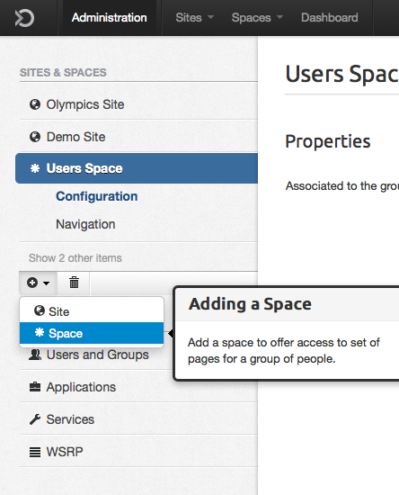
      To create a space, the user just needs to click the button "+" then "Space". To make the label more understandable, a short explanation is shown when mouse is over the link. The following figure represents the sidebar:


      sidebar-popover.png


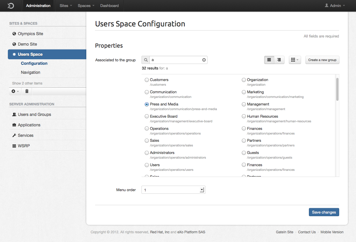
      After clicking Add Space, the page "Configuration" is shown. The user needs to select one of the 15 preset groups, OR to create a new group. The label "priority" was replaced by "menu order", since it defines the order of appearance in the dropdown "Spaces" at the navbar. I made a quick prototype for the functionality that might be improved later:

      space-config.png


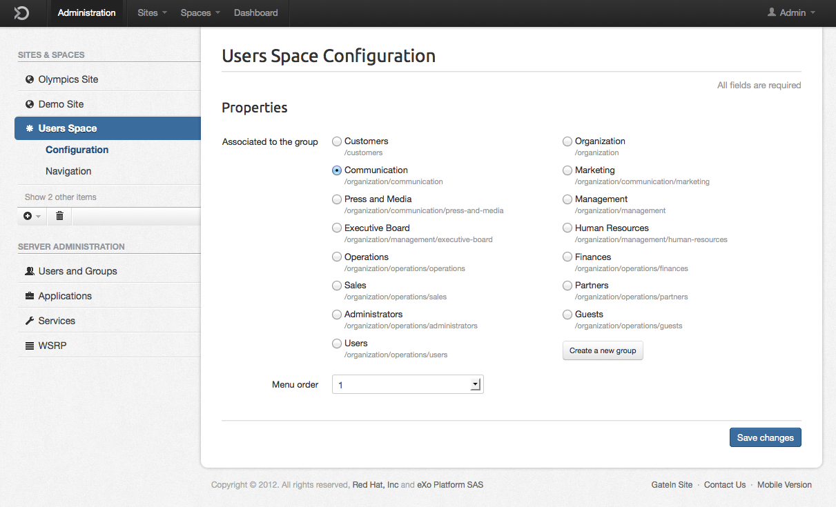
      The option  "create a new group" is opened in a modal box and does not offer the option to add users to the group. The goal here is to only offer the functionality need to achieve this task. To manage users, the admin needs to go to "users and groups" > "group management".


      Screen Shot 2012-07-10 at 9.13.15 PM.png


      The process of setting a Navigation will  be improved with the redesign of the "Site navigation" page that will be done later.


      As a result, the space created can be seen at the Navbar, near the sites and the dashboard.


      The html of this version can be seen at: http://statichtml-theute.rhcloud.com/cardosogabriel/gatein-client/new-space.html

        • 1. Re: Group Navigation (Spaces) in the new Admin UI
          bdaw

          I like and agree with proposed changes.


          Quick comment - for the screen listing existing groups - always take into account that there can be plenty of them (this also may apply to sites). Users will expect to browse bigger number of entries easier and be able to sort/filter them.

          • 2. Re: Group Navigation (Spaces) in the new Admin UI
            julien_viet

            in current UI there is the concept of "root" users which has more privileges than other administrators and is able to modify the navigation/page of a group. This seems to be not taken in accout in this proposal.

            • 3. Re: Group Navigation (Spaces) in the new Admin UI
              bdaw

              I wonder where concept of "root" users should be configured/exposed in the UI. Not sure if fits into Sites Management. I don't think it is exposed in current UI at all actually (correct me if I'm wrong) - only XML - so good moment to include it in requirments.

              • 4. Re: Group Navigation (Spaces) in the new Admin UI
                julien_viet

                it's defined by a specific user name which is "root" by default but can be changed in XML configuration (so it's not cannot be changed at runtime).

                • 5. Re: Group Navigation (Spaces) in the new Admin UI
                  claprun

                  I agree that spaces are quite confusing to users and I like the approach of simplifying the concept for users. I do, however, have 2 concerns with the proposed solution:


                  1. It sidesteps the issue of dealing with what currently exists. Choosing to remove existing spaces is not a UI-domain decision, it's a product-level decision. While I agree that we certainly could trim down the list, it's not part of the UI design. The UI should deal with the existing with its existing constraints, not try to remove these constraints to make the design easier. Same thing goes with the rest of the UI admin proposal actually: it should deal with the existing, not lose features but make them more understandable and approachable. Many of the proposals actually assume that we can just remove what exists to make the design simpler. However, we need to deal with the migration case where people *will* have sites and spaces and we need the UI to properly deal with them, not change what exists because it makes things easier for us. Migrating from one version of EPP to another should be as seamless as possible. I don't believe that we can't come up with a good design without changing the existing and I don't believe that changing the existing for the sake of easier design at the expense of migration issues is a good solution for our users.
                  2. I believe that it would be better to separate Sites and Spaces if we want to de-emphasize the later. Instead of showing a single list combining both Sites and Spaces, we should separate them in two lists. This would have two advantages in my mind. First, we could collapse the Spaces list by default or maybe even not show them at all. It could be part of a Admin-UI level setting to show/hide Spaces. Maybe, we could combine that with a super-Admin mode: i.e. a switch that when activated (off by default) would show everything instead of hiding some stuff. Assuming most users won't use spaces, this simplifies the UI to let users focus on Sites. However, having the switch also allows "power users" to perform the same tasks that they are currently able to perform. Second, it would be easier for users to know what they deal with as in the current proposal the only thing that distinguishes a space from a site in the list is an icon. Moreover, they are mixed which is confusing as it puts them on the same level when we really want to emphasize one (sites) over the other (spaces). The directing idea here would be to hide the complexity until needed (which we hope will be never), not remove it completely.


                  What do you think?

                  • 6. Re: Group Navigation (Spaces) in the new Admin UI
                    claprun

                    Also, if we implemented a super admin mode, we could record stats as to how many times the switch was activated. Actually, we could implement user action tracing to record statistics as to which functions are actually used and which are not so that we can decide later what to add and/or remove in later versions.

                    • 7. Re: Group Navigation (Spaces) in the new Admin UI
                      gcardoso

                      @Boleslaw: Ok, I'll think about a way to allow sorting/filtering. Do you think this can happen with sites too? To have lots of sites?

                      • 8. Re: Group Navigation (Spaces) in the new Admin UI
                        gcardoso

                        @Julien: What's the difference between this root user and the administrator? I thought the "Admin" of the new UI was the root of the current one.

                        • 9. Re: Group Navigation (Spaces) in the new Admin UI
                          gcardoso

                          @Chris: 1) I agree that removing a space is not exclusively an UI-domain decision. However, we can propose things. It's better to be barred from proposing then not proposing at all. I don't see the design as a lipstick in the pig, but as something that can drives product changes too. My proposal was based on utility, not the facilitate my life. So it's a proposal that can be accepted or not

                          2) I think it's a good idea to separate Sites from Spaces for the reasons you listed. Maybe we should display the Spaces expanded at first, so the user can notice it and decide later if he wants to collapse it or not. What do you mean by super-admin mode? The same as Julien's root?

                          Great initiative about the record stats. It would be amazing if we could track the navigation in the UI to make decisions later. Maybe we could implement some tracking for the polemic features?

                          • 10. Re: Group Navigation (Spaces) in the new Admin UI
                            claprun

                            For the first point, my concern is that some of the ideas (while good if we had the leisure of starting from a clean slate) are a little bit outside of the UI design realm and might cause issues with existing installs that should be upgraded as seamlessly as possible. Plus, they also tend to forget the fact that existing users might have used and still rely on the features we want to de-emphasize so, while the new design might try to steer new users away from these features (which might get deprecated/killed after a while), we still need to correctly support. That's the UI challenge we have: clean what we have without changing what already exists underneath while creating a path for a brighter tomorrow! :)

                            • 11. Re: Group Navigation (Spaces) in the new Admin UI
                              claprun

                              For the second point, I think if we really want to move people away from spaces, they should be hidden by default. Let people who still need them find them using the docs as they would know to look for them.

                              • 12. Re: Group Navigation (Spaces) in the new Admin UI
                                gcardoso

                                For the second point I believe that the design must follow an strategy. Do we really need to hide the spaces or do we want people to understand the concept and use this feature? I thought it was the second case...

                                • 13. Re: Group Navigation (Spaces) in the new Admin UI
                                  gcardoso

                                  I sketched up an idea for dealing better with a large list of groups. Here are some scenarios:


                                  1) An user create a space at first and sees only 15 groups (GateIn defaults). In this case I believe it's easier to see all the groups as a list then as hierarchies (tree) since it's possible to see all groups at first and they're not too many.


                                  2) The user has already created or imported some or a bunch of groups, so he can display the info as a tree, which is better to browse in case of many options.


                                  3) To be faster, he can make use of a instant search that filters the content when texting. I believe this search results should only display results as a list (not hierarchies, that are better to browse).


                                  4) It's possible to sort alphabetically by group name or by tree (drop down button).


                                  5) I'm not sure about the performance, but I propose not to have pagination here and update the content when the scroll is near the end of the displayed elements. Chris, do you think it's better and possible?


                                  6) In case of not finding a group that fits his interests, it's possible to create a new one.


                                  Screen Shot 2012-07-12 at 3.27.15 PM.png


                                  This is an initial idea and must be refined to fit also different uses. What do you think about it?

                                  • 14. Re: Group Navigation (Spaces) in the new Admin UI
                                    bdaw

                                    I like the new proposal. Updating content with scroll instead of pagination should be ok for performance IMO (if there are no other technical issues).


                                    Many sites / spaces is something that can happen for sure - in case of both legacy data from migration or less usual portal structure. So this needs to be taken into account. I agree that it would be good idea to split sites and spaces into separate lists.

                                    1 2 3 Previous Next